
Not on the A-List
I’m working on an analysis that compares the classifications of volunteers at Snapshot Serengeti with the classifications of experts for several thousand images from Season 4. This analysis will do two things. First, it will give us an idea of how good (or bad) our simple vote-counting method is for figuring out species in pictures. Second, it will allow us to see if more complicated systems for combining the volunteer data work any better. (Hopefully I’ll have something interesting to say about it next week.)
Right now I’m curating the expert classifications. I’ve allowed the experts to classify an image as “impossible,” which, I know, is totally unfair, since Snapshot Serengeti volunteers don’t get that option. But we all recognize that for some images, it really isn’t possible to figure out what the species is — either because it’s too close or too far or too off the side of the image or too blurry or …. The goal is that whatever our combining method is, it should be able to figure out “impossible” images by combining the non-“impossible” classifications of volunteers. We’ll see if we can do it.
Another challenge that I’m just running into is that our data set of several thousand images contains a duiker. A what? A common duiker, also known as a bush duiker:

Common duiker
You’ve probably noticed that “duiker” is not on the list of animals we provide. While the common duiker is widespread, it’s not commonly seen in the Serengeti, being small and active mainly at night. So we forgot to include it on the list. (Sorry about that.)
The result is that it’s technically impossible for volunteers to properly classify this image. Which means that it’s unlikely that we’ll be able to come up with the correct species identification when we combine volunteer classifications. (Interested in what the votes were for this image? 10 reedbuck, 6 dik dik, and 1 each of bushbuck, wildebeest(!), and impala.)
The duiker is not the only animal that’s popped up unexpectedly since we put together the animal list and launched the site. I never expected we’d catch a bat on film:

Bat
Our friends over at Bat Detective tell us that the glare on the face makes it impossible to truly identify, but they did confirm that it’s a large, insect-eating bat. Anyway, how to classify it? It’s not a bird. It’s not a rodent. And we didn’t allow for an “other” category.
I also didn’t think we’d see insects or spiders.

Spider
Moths fly by, ticks appear on mammal bodies, spiders spin webs in front of the camera and even ants have been seen walking on nearby branches. Again, how should they be classified?
And here’s one more uncommon antelope that we’ve seen:

Steenbok
It’s a steenbok, again not commonly seen in Serengeti. And so we forgot to put it on the list. (Sorry.)
Luckily, all these animals we missed from the list are rare enough in our data that when we analyze thousands of images, the small error in species identification won’t matter much. But it’s good to know that these rarely seen animals are there. When Season 5 comes out (soon!), if you run into anything you think isn’t on our list, please comment in Talk with a hash-tag, so we can make a note of these rarities. Thanks!
Detecting the right number of animals
This past spring, four seniors in the University of Minnesota’s Department of Fisheries, Wildlife, and Conservation Biology took a class called “Analysis of Populations,” taught by Professor Todd Arnold. Layne Warner, Samantha Helle, Rachel Leuthard, and Jessica Bass decided to use Snapshot Serengeti data for their major project in the course.
Their main question was to ask whether the Snapshot Serengeti images are giving us good information about the number of animals in each picture. If you’ve been reading the blog for a while, you know that I’ve been exploring whether it’s possible to correctly identify the species in each picture, but I haven’t yet looked at how well we do with the actual number of animals. So I’m really excited about their project and their results.
Since the semester is winding up, I thought we’d try something that some other Zooniverse projects have done: a video chat*. So here I am talking with Layne, Samantha, and Rachel (Jessica couldn’t make it) about their project. And Ali just got back to Minnesota from Serengeti, so she joined in, too.
Here are examples of the four types of covariates (i.e. potential problems) that the team looked at: Herd, Distance, Period, Vegetation
Herd: animals are hard to count because they are in groups

Herd
Distance: animals are hard to count because they are very close to or very far from the camera

Distance
Period: animals are hard to count because of the time of day

Period
Vegetation: animals are hard to count because of surrounding vegetation

Vegetation
* This was our first foray into video, so please excuse the wobbly camera and audio problems. We’ll try to do better next time…
Volunteer Visualizations
At the Zooniverse workshop last week, Philip Brohan (of Old Weather fame) showed me how to produce a cool graphic of volunteer participation. So I put together a couple graphics – one for Season 1 and one for Season 4 – to see if patterns of who does what changed over time.
In these graphics, each square represents one volunteer. And the size of the square shows how many classifications that volunteer did.
Here’s Season 1:

The big blue square is all the volunteers who didn’t create a user account; since I can’t track them without an ID, they all get lumped together. Probably most of the people in this blue square did just a few classifications at most. All together there are just over 15,000 people who created an account represented here. Those that did fewer than 50 classifications each are lumped together under the big blue square. You can see that the majority of the work was done by people who between 50 and 1,000 classifications each. There were another 100 or so volunteers who did over 1,000 classifications in Season 1.
Now here’s Season 4:
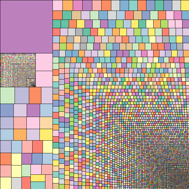
This time, it’s the big purple square that represents all the volunteers who didn’t create an account; the square is smaller than in Season 1, which isn’t very surprising. Those folks that don’t log in are generally looking at the site for the first time and we expect more of them when Snapshot Serengeti first started than later on. All together, there are about 7,500 people who created an account and who worked on Season 4 – about half the number of Season 1. The square below the purple square shows all the volunteers who did fewer than 50 classifications. You can see that the majority of the work is being done by our thousands of dedicated fans; about half of all people who worked on Season 4 did more than 50 classifications, and these volunteers accounted for the vast majority of all classifications.
PS. The Zooniverse is launching a new project today: SpaceWarps. Go check it out, while we work on getting Season 5 ready for you.
Trees
The rain is crazy. Not as windy as yesterday, when it blew our furniture off the veranda, but crazy nonetheless. I could see it coming, not just your typical clouds stretching to the earth in the distance – I could see the waves of water hitting the ground between the scattered trees, moving closer with every second. It was a race – I wanted to reach the valley, with its low profile and scattered trees, before the storm reached me. I know that in a lightening storm, you’re not supposed to seek shelter beneath a tree. But in my giant Landrover, with its 4.5 foot antennae beckoning to the sky, I don’t like being the only blip on the plains. Logical or not. (Comments from lightning experts welcome.)
And so here I am. Somewhere between cameras L05 and L06, hunkered down as the torrents of water wash over Arnold & me. The endless tubes of silicone sealant have done their job – most of me, and most of my equipment, is dry – there are only two leaks in the roof.
The sky is gray for miles – I am done for the day. It’s only 5pm! In wet season, I can normally work until 7pm, and still prep my car for camping before it’s too dark to see. Today feels like one of those cherished half-days from elementary school – not as magical as a snow day, mind you, but exciting nonetheless. Except I am trapped in my car…
So, with that, I open a beer, shake out the ants and grass clippings from my shirt, and hunker down in the front seat to wait out the rain. And to think. I’ve been thinking a lot about trees lately. Mostly what they mean for the how the carnivores are using their landscape.
See, from the radio-collaring data, we know that lions are densest in the woodlands. Living at high densities that is, not stupid. But the cameras in the woodlands don’t “see” lions very well. Out on the plains, a lone tree is a huge attractant. It’s the only shade for miles, the only blip on the horizon. All the carnivores, but expecially the musclebound, heat-stressed lions, will seek it out. In contrast, in the woodlands, even though there are more lions, the odds of them walking in front of the one of 10,000 trees that has my camera on it are…slim.
This map is one of many I’ve been making the last week or so. Here, lion densities, as calculated from radiocollar data, are the red background cells; camera traps are in circles, sized proportionally to the number of lions captured there. As you can see, the sheer number of lions captured in each camera trap doesn’t line up especially well with known lion densities. Disappointing, but perhaps unsurprising. One camera really only captures a very tiny window in front of it – not the whole 5km2 grid cell whose center it sits in. One of my goals, therefore, is to use what we know about the habitat to align the camera data with what we know about lion ranging patterns. I think the answer lies in characterizing the habitat at multiple different spatial scales – spatial scales that matter to the decision-making of a heat-stressed carnivore who sees blips on the horizon as oases of shade. And so I’m counting trees. Trees within 20 meters, 50 meters, 200 meters of the camera. One tree in a thick clump is still pretty attractive if that clump is the only thing for miles. Once I can interpret the landscape for lions, once I can match camera data with what we know to be true for lion ranging, I can be comfortable interpreting patterns for the other species. I hope.
The rain is letting up now, and it’s getting dark. Time to pack the car for camping – equipment on the roof and in the front seat. Bed in the back. And a sunset to watch with beer in hand.
And the winner is …
Surprisingly, the easiest animal to identify is the PORCUPINE. Of all porcupine images in Season 4, only two classifications were wrong. Here are the rankings for the top ten, along with the percentage correct for each animal.
| Rank | Animal | Percent Correct |
| 1 | Porcupine | 99.4% |
| 2 | Human | 99.2% |
| 3 | Ostrich | 98.3% |
| 4 | Giraffe | 97.1% |
| 5 | Elephant | 97.0% |
| 6 | Zebra | 95.9% |
| 7 | Hippopotamus | 95.1% |
| 8 | Guinea fowl | 92.1% |
| 9 | Wildebeest | 91.9% |
| 10 | Spotted hyena | 91.2% |

Top Ten Easy Animals
Better with Practice
This week, I’ve been starting to think about how to approach those “hard to figure out” images. Now, of course, some of them are going to be impossible images – those that are so far away or close or off the edge that even an expert could not accurately identify the species in them. But some of them are just tricky images that an expert could identify, but would be difficult for someone just starting out with Snapshot Serengeti to figure out.
So here’s a thought: do Snapshot Serengeti volunteers get better at classifying over time? If so, then we should see that, on average, volunteers who have classified more images have a higher batting average than those who have classified fewer images. And if that’s the case, maybe we could use this information to help with the “hard to figure out” images; maybe we could take into account how experience a volunteer is when they classify one of these tricky ones.
To see if volunteers get better at classifying with more experience, I took the data from Season 4 that I’ve written about the past couple weeks, and looked at how well volunteers did based on how many Season 4 images they had classified. Of course, this isn’t perfect, as someone could have gotten a lot of experience with Seasons 1-3 and only just done a little bit on Season 4. But I’m going to assume that, in general, if someone with a lot of early-on experience came back to do Season 4, then they did a lot of images in Season 4, too.
And here’s the answer: yes, volunteers do get better with experience. (Click on it to make it bigger.)
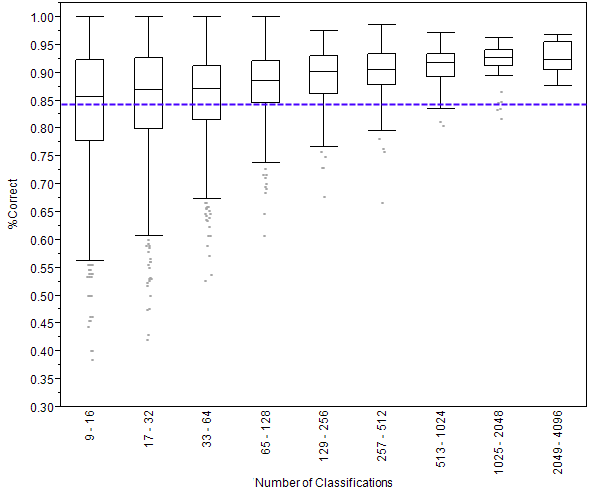
What you see above is called a box plot. On the left side is the percentage of images that were classified correctly. A 1.00 would be perfect and 00.0 would be getting everything wrong. Then you see nine rectangles going across. Each of these is called a box. The key line to look at in these boxes is the one that crosses through the middle. This line shows the median score. Remember that the median score is the score of the person in the very middle of the line if we were to line up everyone by how well they did. (Want to learn more about box plots?)
I’ve divided volunteers into these nine boxes, according to how many classifications they made. The number of classifications is written sideways at the bottom. So, for example, the leftmost box shows the scores of people who made 9 to 16 classifications. You can see that as the number of classifications gets bigger (as we go from left to right on the graph) the scores go up. Someone who does just 14 classifications gets 12 of them right, on average, for a score of 86%. But someone who does 1400 classifications gets 1300 of them right on average, for a score of 93%.
Finally, the purple dashed line shows the average score of all the anonymous volunteers – those that don’t create a user name. We know that these volunteers tend to do fewer classifications than those who create accounts, and this graph shows us that volunteers who create user names score better, on average, than those who don’t.
On a completely different note, if you haven’t seen it already, Rob Verger wrote a really nice piece on Snapshot Serengeti over at the Daily Beast. I recommend checking it out.
Or, read on for details on how I made this graph.
The Wrong Answers
Ever since I started looking into the results from Season 4, I’ve been interested in those classifications that are wrong. Now, when I say “wrong,” I really mean the classifications that don’t agree with the majority of volunteers’ classifications. And technically, that doesn’t mean that these classifications are wrong in an absolute sense — it’s possible that two people classified something correctly and ten people classified it wrong, but all happened to classify it wrong the same way. This distinction between disagreement with the majority and wrong in an absolute sense is important, and is something I’m continuing to explore.
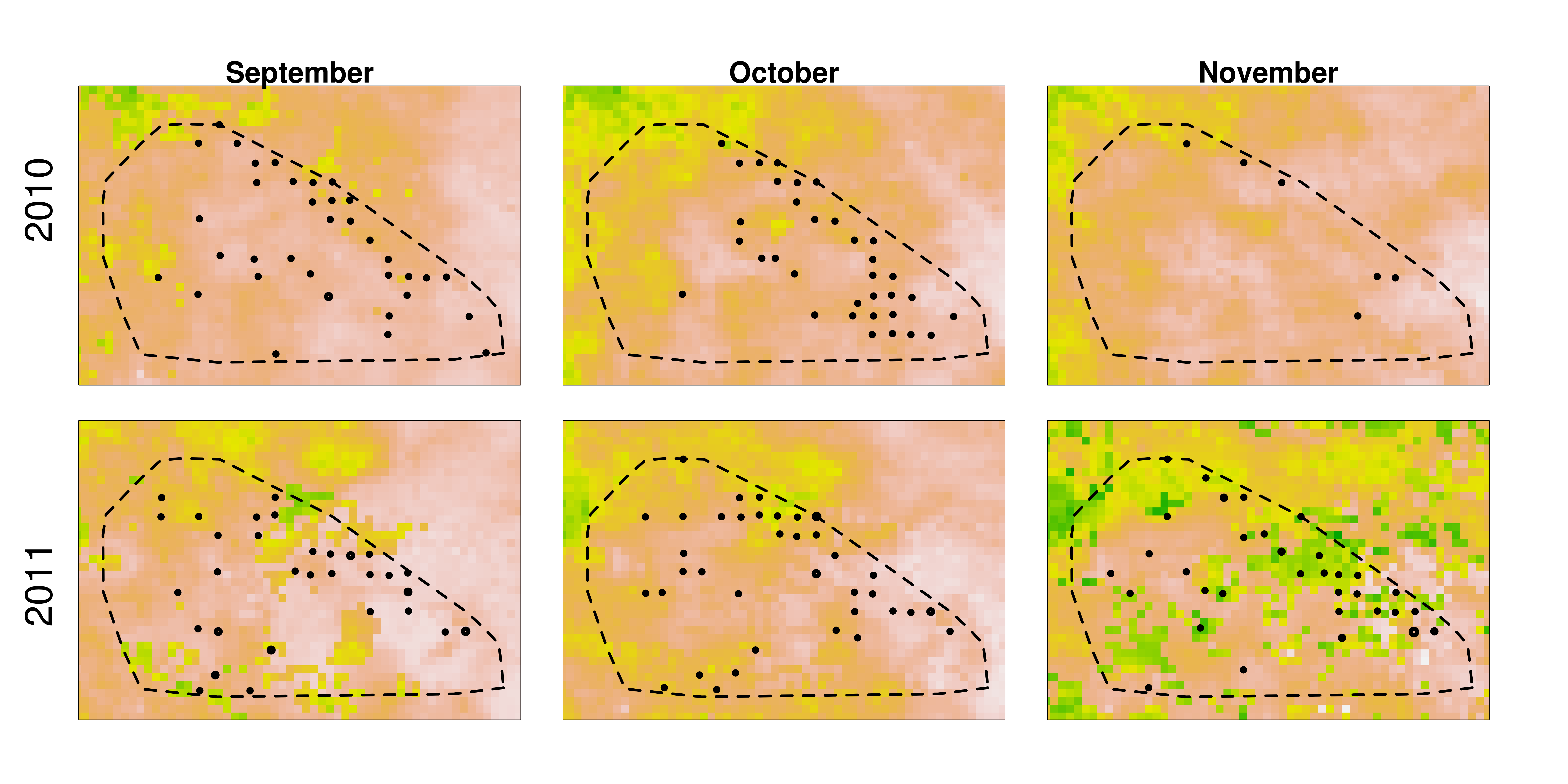
But for right now, let’s just talk about those classifications that don’t agree with the majority. To first look at these “wrong” classifications, I created what’s called a heat map. (Click to make it bigger.)

This map shows all the classifications made in Season 4 for images with just one species in it. (More details on how it’s made at the end, for those who want to know.) The species across the bottom of the map are the “right” answers for each image, and the species along the left side are all the classifications made. Each square represents the number of votes for the species along the left side in an image where the majority voted for the species across the bottom. Darker squares mean more votes.
So, for example, if you find aardvark on the bottom and look at the squares in the column above it, you’ll see that the darkest square corresponds to where there is also aardvark on the left side. This means that for all images in which the majority votes was for aardvark, the most votes went to aardvark — which isn’t any surprise at all. In fact, it’s the reason we see that strong diagonal line from top left to bottom right. But we can can also see that in these majority-aardvark images, some people voted for aardwolf, bat-eared fox, dik-dik, hare, striped hyena, and reedbuck.
If we look at the heat map for dark squares other than the diagonal ones, we can see which animals are most likely confused. I’ve circled in red some of the confusions that aren’t too surprising: wildebeest vs. buffalo, Grant’s gazelle vs. Thomson’s gazelle, male lion vs. female lion (probably when only the back part of the animal can be seen), topi vs. hartebeest, hartebeest vs. impala and eland(!), and impala vs. Grant’s and Thomson’s gazelle.
In light blue, I’ve also circled a couple other interesting dark spots: other-birds being confused with buffalo and hartebeest? Unlikely. I think what’s going on here is that there is likely a bird riding along with the large mammal. Not enough people classified the bird for the image to make it into my two-species group, and so we’re left with these extra classifications for a second species.
It’s also interesting to look at the white space. If you look at the column above reptiles, you see all white except for where it matches itself on the diagonal. That means that if the image was of a reptile, everyone got it. There was no confusing reptiles for anything else. Part of this is that there are so few reptile images to get wrong. You can see that wildebeest have been misclassified as everything. I think that has more to do with there being over 17,000 wildebeest images to get wrong, rather than wildebeest being particularly difficult to identify.
What interesting things do you see in this heat map?
(Read on for the nitty gritty or stop here if you’ve had enough.)
Some Results from Season 4
I was asked in the comments to last week’s blog post if I could provide some feedback about the results of Season 4. If you felt like you were seeing a lot of “nothing here” images, you’re right: of the 158,098 unique capture events we showed you, 70% were classified as having no animals in them. That left 47,320 with animals in them to classify, and the vast majority of these (94%) contained just one species. Here’s the breakdown of what was in all those images:

Maybe it won’t surprise you that Season 4 covered 2012’s wet season, when over a million wildebeest, zebra, and Thomson’s gazelle migrate through our study area. I find it interesting that hartebeest are also pretty numerous, but I wonder if it’s because of that one hartebeest that stood in front of the camera for hours on end.
This pie chart is based on the number of what we call “capture events,” which is the set of 1 or 3 pictures you see every time you make a classification. Once a camera has taken a set of pictures, we delay it from triggering again for about a minute. That way we don’t fill up the camera’s memory card with too many repeats of the same animals before we have a chance to replace them. But a minute isn’t a very long time for an animal that has decided to camp out in front of a camera, and so we frequently get sequences of many capture events that are all of the same animal. One of the things we’ll have to do in turning your classifications into valid research results is to figure out how to find these sequences in the data automatically.
Here’s a sequence of an elephant family hanging out around our camera for the night about a year ago. (Hat tip to dms246 who put together a collection of most of these images to answer the concerned question of some classifiers who saw just one image out of the whole sequence: is that elephant dead or just sleeping?)
1, 2, 3, 4, 5, 6, 7, 8, 9, 10, 11, 12, 13, 14, 15, 16, 17, 18, 19, 20, 21, 22, 23, 24, 25, 26, 27, 28, 29, 30, 31
If you’re interested in how I made the above pie chart, keep reading. But we’re going to get technical here, so if algorithms don’t interest you, feel free to stop.
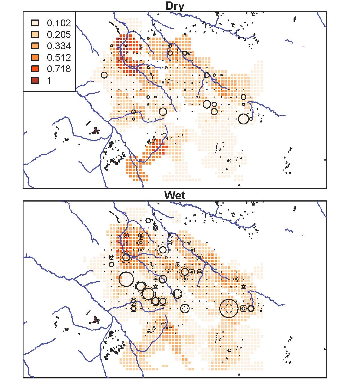
Grant Proposal Writing
We’ve recently been working on a grant proposal to continue our camera trap project past 2012. Grant proposal time is always a little bit hectic, and particularly so this time for Ali, who, while running around Arusha to get research permits and supplies and get equipment fixed, has also been ducking into Internet cafes to help with the proposal. This proposal is going to the National Science Foundation, which has funded the bulk of the long-term Lion Project, as well as the first three years of the camera trap survey.
The proposal system is two-tiered. First we submit what is called a “pre-proposal” – a relatively short account of what we want to study and why, along with researchers’ credentials. This is the proposal that’s due today. Over the next six months, NSF will convene a panel to review all the pre-proposals that it receives and will select a fraction of them to invite for a “full proposal” due in August. If we get selected, we will then have to write up a more extensive proposal, describing not only what and why we want to do this research, but also exactly how we’re going to do it and how much money we require. Then another panel is convened to review these proposals, with the results reported in November or December.
Proposals are always helped by “preliminary data” – that is, data that’s not yet ready for publication, but gives a hint at a research study’s power. So we’ve taken the Snapshot Serengeti classifications for Seasons 1-4, run a quick-and-dirty algorithm to pull out images of wildebeest and hartebeest, and then stuck the results on maps, grouped by month. The size of the circles shows how many wildebeest or hartebeest were seen that month by a camera. The background colors show ground vegetation derived from satellite images, so green means, well, the vegetation is green, whereas yellow means less green vegetation, and tan means very little green vegetation.

Wildebeest in the dry season (Season 1 and Season 3 on Snapshot Serengeti)
Hartebeest in the dry season (Season 1 and Season 3 on Snapshot Serengeti)
Wildebeest in the wet season (Season 2 and Season 4 on Snapshot Serengeti)
Hartebeest in the wet season (Season 2 and Season 4 on Snapshot Serengeti)
(You can click on any of these images to see a larger version.)
These maps show variation from month to month and season to season in the greenness of the vegetation and the response of the grazers to that vegetation. They also show that these patterns vary from year to year. We’ve used this variation as a foundation to our proposal: how do these different patterns in vegetation that vary over time affect the grazers in the Serengeti? How do the variations in grazers affect the predators?
What questions spring to your mind when you look at these maps?
