What we’ve seen so far, Part IV
Last week I wrote about using really simple approaches to interpret camera trap data. Doing so makes the cameras a really powerful tool that virtually any research team around the world can use to quickly survey an ecosystem.
Existing monitoring projects in Serengeti give us a really rare opportunity to actually validate our results from Snapshot Serengeti: we can compare what we’re seeing in the cameras to what we see, say, from radio-tracking collared lions, or to the number of buffalo and elephants counted during routine flight surveys.
One of the things we’ve been hoping to do with the cameras is to use them to understand where species are, and how those distributions change. As you know, I’ve struggled a bit with matching lion photographs to known lion ranging patterns. Lions like shade, and because of that, they are drawn to camera traps on lone, shady trees on the plains from miles and miles away.
But I’ve finally been able to compare camera trap captures to know distributions for other animals. Well, one other animal: giraffes. From 2008-2010, another UMN graduate student, Megan Strauss, studied Serengeti giraffes and recorded where they were. By comparing her data with camera trap data, we can see that the cameras do okay.
The graph below compares camera trap captures to known densities of giraffes and lions. Each circle represents a camera trap; the bigger the circle, the more photos of giraffes (top row) or lions (bottom row). The background colors reflect known relative densities measured from long-term monitoring: green means more giraffes or lions; tan/white means fewer. For giraffes, on the whole, we get more giraffe photos in places that have more giraffes. That’s a good sign. The scatterplot visualizes the map in a different way, showing the number of photos on the y-axis vs. the known relative densities on the x-axis.
What we see is that cameras work okay for giraffes, but not so much for lions. Again, I suspect that this has a lot to do with the fact that lions are incredibly heat stressed, and actively seek out shade (which they then sleep in for 20 hours!). But lions are pretty unique in their extreme need for shade, so cameras probably work better for most other species. We see the cameras working better for giraffes, which is a good sign.
We’ve got plans to explore this further. In fact, Season 7 will overlap with a wildebeest study that put GPS collars on a whole bunch of migratory wildebeest. For the first time, we’ll be able to compare really fine scale data on the wildebeest movements to the camera trap photos, and we can test even more precisely just how well the cameras work for tracking large-scale animal movements. Exciting!
What we’ve seen so far, Part III
Over the last few weeks, I’ve shared some of our preliminary findings from Seasons 1-6 here and here. As we’re still wrapping up the final stages of preparation for Season 7, I thought I’d continue in that vein.
One of the coolest things about camera traps is our ability to simultaneously monitor many different animal species all at once. This is a big deal. If we want to protect the world around us, we need to understand how it works. But the world is incredibly complex, and the dynamics of natural systems are driven by many different species interacting with many others. And since some of these critters roam for hundreds or thousands of miles, studying them is really hard.
I have for a while now been really excited about the ability of camera traps to help scientists study all of these different species all at once. But cameras are tricky, because turning those photographs into actual data on species isn’t always straightforward. Some species, for example, seem to really like cameras,

so we see them more often than we really should — meaning we might think there are more of that critter than there really are. There are statistical approaches to deal with this kind of bias in the photos, but these statistics are really complex and time consuming.
This has actually sparked a bit of a debate among researchers who use camera traps. Researchers and conservationists have begun to advocate camera traps as a cost-effective, efficient, and accessible way to quickly survey many understudied, threatened ecosystems around the world. They argue that basic counting of photographs of different species is okay as a first pass to understand what animals are there and how many of them there are. And that requiring the use of the really complex stats might hinder our ability to quickly survey threatened ecosystems.
So, what do we do? Are these simple counts of photographs actually any good? Or do we need to spend months turning them into more accurate numbers?
Snapshot Serengeti is really lucky in that many animals have been studied in Serengeti over the years. Meaning that unlike many camera trap surveys, we can actually check our data against a big pile of existing knowledge. In doing so, we can figure out what sorts of things cameras are good at and what they’re not.
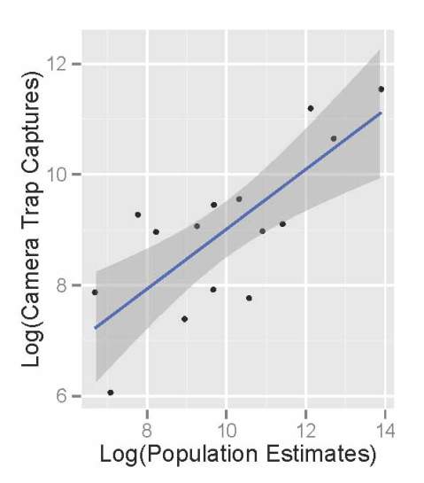
Comparing the raw photographic capture rates of major Serengeti herbivores to their population sizes as estimated in the early 2000’s, we see that the cameras do an okay job of reflecting the relative abundance of different species. The scatterplot below shows the population sizes of 14 major herbivores estimated from Serengeti monitoring projects on the x-axis, and camera trap photograph rates of those herbivores on the y-axis. (We take the logarithm of the value for statistical reasons.) There are really more wildebeest than zebra than buffalo than eland, and we see these patterns in the number of photographs taken.
Like we saw the other week, monthly captures shows that we can get a decent sense of how these relative abundances change through time.
So, by comparing the camera trash photos to known data, we see that they do a pretty good job of sketching out some basics about the animals. But the relationship also isn’t perfect.
So, in the end, I think that our Snapshot Serengeti data suggests that cameras are a fantastic tool and that raw photographic capture rates can be used to quickly develop a rough understanding of new places, especially when researchers need to move quickly. But to actually produce specific numbers, say, how many buffalo per square-km there are, we need to dive in to the more complicated statistics. And that’s okay.
Some Results from Season 4
I was asked in the comments to last week’s blog post if I could provide some feedback about the results of Season 4. If you felt like you were seeing a lot of “nothing here” images, you’re right: of the 158,098 unique capture events we showed you, 70% were classified as having no animals in them. That left 47,320 with animals in them to classify, and the vast majority of these (94%) contained just one species. Here’s the breakdown of what was in all those images:
Maybe it won’t surprise you that Season 4 covered 2012’s wet season, when over a million wildebeest, zebra, and Thomson’s gazelle migrate through our study area. I find it interesting that hartebeest are also pretty numerous, but I wonder if it’s because of that one hartebeest that stood in front of the camera for hours on end.
This pie chart is based on the number of what we call “capture events,” which is the set of 1 or 3 pictures you see every time you make a classification. Once a camera has taken a set of pictures, we delay it from triggering again for about a minute. That way we don’t fill up the camera’s memory card with too many repeats of the same animals before we have a chance to replace them. But a minute isn’t a very long time for an animal that has decided to camp out in front of a camera, and so we frequently get sequences of many capture events that are all of the same animal. One of the things we’ll have to do in turning your classifications into valid research results is to figure out how to find these sequences in the data automatically.
Here’s a sequence of an elephant family hanging out around our camera for the night about a year ago. (Hat tip to dms246 who put together a collection of most of these images to answer the concerned question of some classifiers who saw just one image out of the whole sequence: is that elephant dead or just sleeping?)
1, 2, 3, 4, 5, 6, 7, 8, 9, 10, 11, 12, 13, 14, 15, 16, 17, 18, 19, 20, 21, 22, 23, 24, 25, 26, 27, 28, 29, 30, 31
If you’re interested in how I made the above pie chart, keep reading. But we’re going to get technical here, so if algorithms don’t interest you, feel free to stop.
We need an ‘I don’t know’ button!
Okay, okay. I hear you. I know it’s really frustrating when you get an image with a partial flank or a far away beast or maybe just an ear tip. I recognize that you can’t tell for sure what that animal is. But part of why people are better at this sort of identification process than computers is that you can figure out partial information; you can narrow down your guess. That partial flank has short brown hair with no stripes or bars. And it’s tall enough that you can rule out all the short critters. Well, now you’ve really narrowed it down quite a lot. Can you be sure it’s a wildebeest and not a buffalo? No. But by taking a good guess, you’ve provided us with real, solid information.
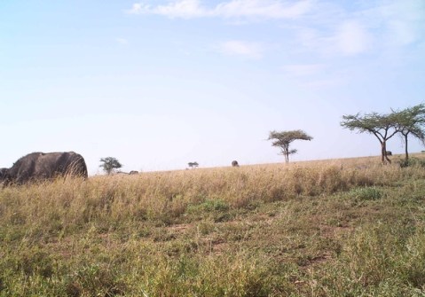
We show each image to multiple people. Based on how much the first several people agree, we may show the image to many more people. And when we take everyone’s identifications into account, we get the right answer. Let me show you some examples to make this clearer. Here’s an easy one:
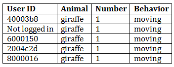
And if we look at how this got classified, we’re not surprised:
I don’t even have to look at the picture. If you hid it from me and only gave me the data, I would tell you that I am 100% certain that there is one moving giraffe in that image.
Okay, let’s take a harder image and its classifications:
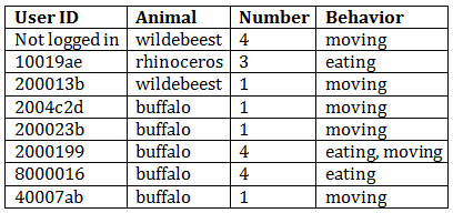
This image is, in fact, of buffalo – at least the one on the foreground is, and it’s reasonable to assume the others are, too. Our algorithm would also conclude from the data table that this image is almost certainly of buffalo – 63% of classifiers agreed on that, and the other three classifications are ones that are easily confused with buffalo. We can also figure out from the data you’ve provided us that the buffalo are likely eating and moving, and that there is one obvious buffalo and another 2 or 3 ones that are harder to tell.
My point in showing you this example is that even with fairly difficult images, you (as a group) get it right! If you (personally) mess up an image here or there, it’s no big deal. If you’re having trouble deciding between two animals, pick one – you’ll probably be right.
Now what if we had allowed people to have an ‘I don’t know’ button for this last image? I bet that half of them would have pressed, ‘I don’t know.’ We’d be left with just 4 identifications and would need to send out this hard image to even more people. Then half of those people would click ‘I don’t know’ and we’d have to send it out to more people. You see where I’m going with this? An ‘I don’t know’ button would guarantee that you would get many, many more annoying, frustrating, and difficult images because other people would have clicked ‘I don’t know.’ When we don’t have an ‘I don’t know’ button, you give us some information about the image, and that information allows us to figure out each image faster – even the difficult ones.
“Fine, fine,” you might be saying. “But seriously, some of those images are impossible. Don’t you want to know that?”
Well, yes, we do want to know that. But it turns out that when you guess an animal and press “identify” on an impossible image, you do tell us that. Or, rather, as a group, you do. Let’s look at one:
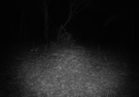
Now I freely admit that it is impossible to accurately identify this animal. What do you guys say? Well…
Right. So there is one animal moving. And the guesses as to what that animal is are all over the place. So we don’t know. But wait! We do know a little; all those guesses are of small animals, so we can conclude that there is one small animal moving. Is that useful to our research? Maybe. If we’re looking at hyena and leopard ranging patterns, for example, we know whatever animal got caught in this image is not one we have to worry about.
So, yes, I know you’d love to have an ‘I don’t know’ button. I, myself, have volunteered on other Zooniverse projects and have wished to be able to say that I really can’t tell what kind of galaxy that is or what type of cyclone I’m looking at. But in the end, not having that button there means that you get fewer of the annoying, difficult images, and also that we get the right answers, even for impossible images.
So go ahead. Make a guess on that tough one. We’ll thank you.

