
Better with Practice
This week, I’ve been starting to think about how to approach those “hard to figure out” images. Now, of course, some of them are going to be impossible images – those that are so far away or close or off the edge that even an expert could not accurately identify the species in them. But some of them are just tricky images that an expert could identify, but would be difficult for someone just starting out with Snapshot Serengeti to figure out.
So here’s a thought: do Snapshot Serengeti volunteers get better at classifying over time? If so, then we should see that, on average, volunteers who have classified more images have a higher batting average than those who have classified fewer images. And if that’s the case, maybe we could use this information to help with the “hard to figure out” images; maybe we could take into account how experience a volunteer is when they classify one of these tricky ones.
To see if volunteers get better at classifying with more experience, I took the data from Season 4 that I’ve written about the past couple weeks, and looked at how well volunteers did based on how many Season 4 images they had classified. Of course, this isn’t perfect, as someone could have gotten a lot of experience with Seasons 1-3 and only just done a little bit on Season 4. But I’m going to assume that, in general, if someone with a lot of early-on experience came back to do Season 4, then they did a lot of images in Season 4, too.
And here’s the answer: yes, volunteers do get better with experience. (Click on it to make it bigger.)
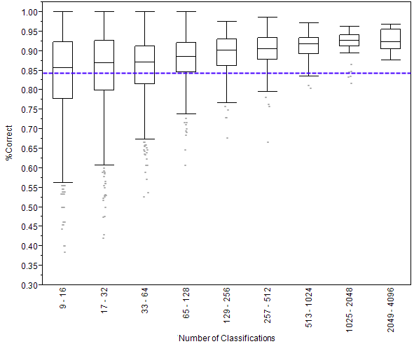
What you see above is called a box plot. On the left side is the percentage of images that were classified correctly. A 1.00 would be perfect and 00.0 would be getting everything wrong. Then you see nine rectangles going across. Each of these is called a box. The key line to look at in these boxes is the one that crosses through the middle. This line shows the median score. Remember that the median score is the score of the person in the very middle of the line if we were to line up everyone by how well they did. (Want to learn more about box plots?)
I’ve divided volunteers into these nine boxes, according to how many classifications they made. The number of classifications is written sideways at the bottom. So, for example, the leftmost box shows the scores of people who made 9 to 16 classifications. You can see that as the number of classifications gets bigger (as we go from left to right on the graph) the scores go up. Someone who does just 14 classifications gets 12 of them right, on average, for a score of 86%. But someone who does 1400 classifications gets 1300 of them right on average, for a score of 93%.
Finally, the purple dashed line shows the average score of all the anonymous volunteers – those that don’t create a user name. We know that these volunteers tend to do fewer classifications than those who create accounts, and this graph shows us that volunteers who create user names score better, on average, than those who don’t.
On a completely different note, if you haven’t seen it already, Rob Verger wrote a really nice piece on Snapshot Serengeti over at the Daily Beast. I recommend checking it out.
Or, read on for details on how I made this graph.
The Nitty Gritty
To make this graph, I started with the analysis I described in ‘Some Results from Season 4’ and then pulled out single-species capture events and omitted ones without enough classifications and ones that were “hard to figure out.” Just like I did last week, I labeled each classification with the “correct” identification.
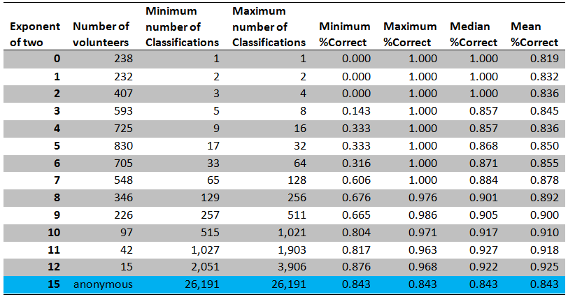
Then, for each volunteer, I counted the number of classifications where the classification agreed with the correct identification. And I divided this number by the total number of classifications that volunteer did in order to calculate the volunteer’s score. The result was scores for a total of 5,004 unique volunteers plus one score for the anonymous volunteers all lumped together.
To make the box plot, I used the software JMP. The boxes show the standard median and upper and lower quartiles. JMP calculates the ends of the whiskers as the upper (lower) quartiles + (-) 1.5 * interquartile range. Gray points outside below the whiskers are outliers, one point per volunteer.
Especially computer-savvy readers have probably already noticed that I’ve divided up the volunteers by looking at the number of classifications by powers of two. I did this to make the numbers of volunteers in each pile more equal, as the distribution of classifications is heavily skewed toward very few. It’s essentially taking the log (base 2) of the number of classifications, just the way I did in creating the heat map last week. I don’t show the people who made very few classifications (8 or less) because their box plots look strange. Imagine if you’d only classified one image: then you have a score of either 100% or 0% and the median will therefore be either 0 or 1, and the box plot would be similarly skewed.
Here’s a table summary of the data that went into the graph. (Click on it to make it bigger.)

I know I’ve gotten better with practice! In a dark capture, I sometimes can tell from where the eyes are lit up what type of animal it is. And most of the animals are quite familiar by now. These statistics are fascinating! Thanks Margaret!
I’ve definitely improved my identification skills. My most frustrating problem is sorting out the “piles” of wildebeest. Anybody have a trick for deciding which head belongs to which spine?
I miss two columns for 4097-8194 and 8195-16290 classifications. It looks as if passing the 2048 mark makes the percentage of correct classifications drop?
There aren’t any columns for 4097 and higher; no one classified that many of the images analyzed here. The median score in the last column (2049-4096) is slightly lower, but the mean is actually higher. My conclusion is that there isn’t any appreciable difference between those in the 1025-2048 category and the 2049-4096 one.
Hi Margaret Kosmala, Ihave been in the bush in Australia ,Victoria mostly and from a horse had see animals around me as well as watch for things ahead of the horse like holes and fallen tree limbs ,and so became fairly good at observations . I have done about 5000 images . Some are imposable to do and others that are borderline can be figured out with the right knowledge . I also do Cyclone Center images and having lived out doors know a lot about weather . and I have been doing the harder images for them and have not had any complaints so what you said about getting the people that have more experience to do the more difficult images , makes a lot of sense to me . Sorry for being long winded .Ian shocko61
HI there, not sure where to write this… but just wanted to comment that I find it interesting that some types of animals seem to interact with the cameras. I’ve noticed a few times the gazelles seem quite curious. Also many shots of wildebeest gathering and resting in front of the cameras at night. Have any studies been done on this? Am I just imagining it?
Hi Barbara, I’ve noticed the same thing. The gazelles sure do seem to be the most curious animals in this group. If you want to get more responses, try clicking on discuss and posting there. Enjoy!