
What we’ve seen so far, Part IV
Last week I wrote about using really simple approaches to interpret camera trap data. Doing so makes the cameras a really powerful tool that virtually any research team around the world can use to quickly survey an ecosystem.
Existing monitoring projects in Serengeti give us a really rare opportunity to actually validate our results from Snapshot Serengeti: we can compare what we’re seeing in the cameras to what we see, say, from radio-tracking collared lions, or to the number of buffalo and elephants counted during routine flight surveys.
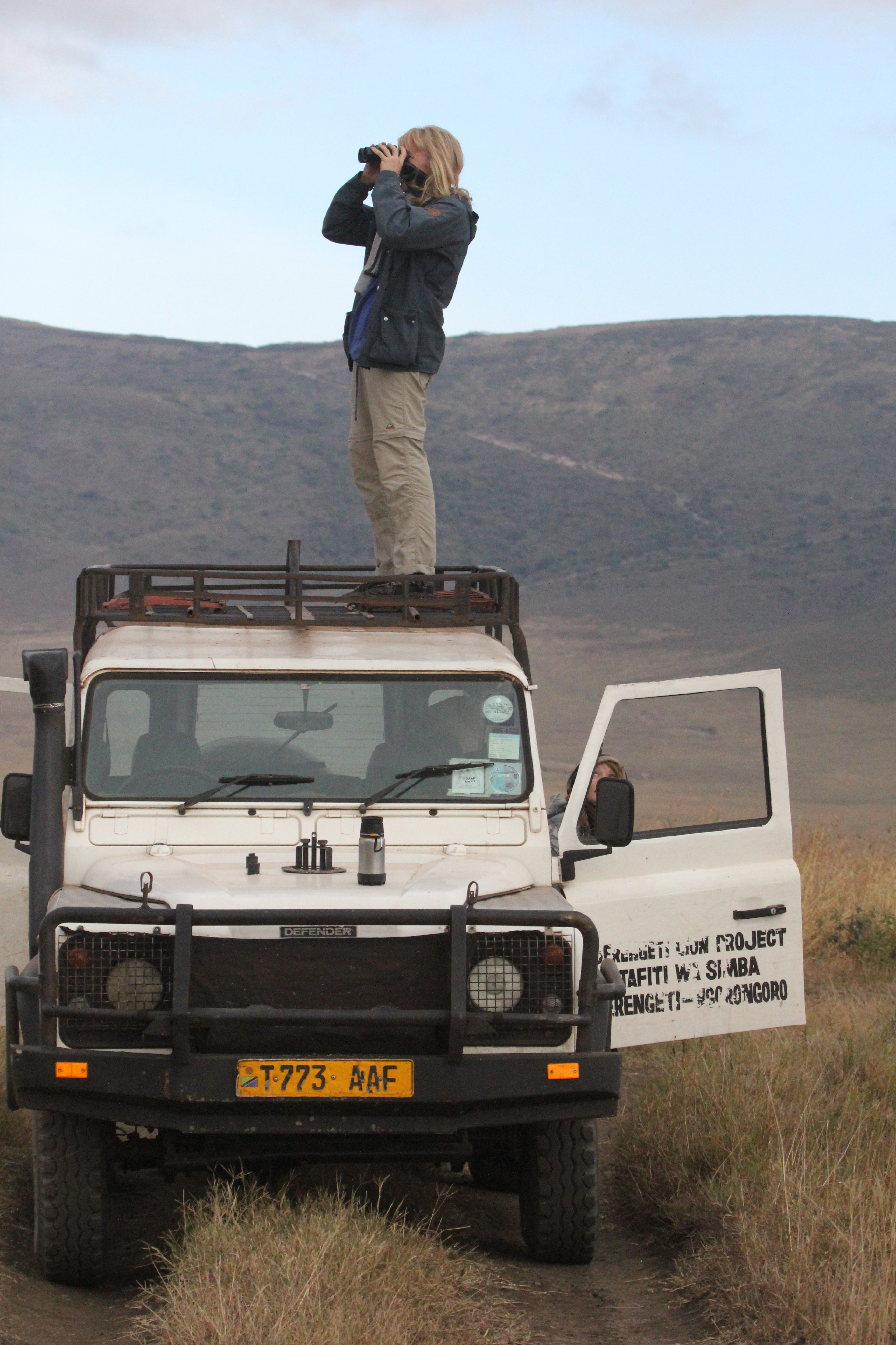
Ingela scanning for lions from the roof of the car.
One of the things we’ve been hoping to do with the cameras is to use them to understand where species are, and how those distributions change. As you know, I’ve struggled a bit with matching lion photographs to known lion ranging patterns. Lions like shade, and because of that, they are drawn to camera traps on lone, shady trees on the plains from miles and miles away.
But I’ve finally been able to compare camera trap captures to know distributions for other animals. Well, one other animal: giraffes. From 2008-2010, another UMN graduate student, Megan Strauss, studied Serengeti giraffes and recorded where they were. By comparing her data with camera trap data, we can see that the cameras do okay.
The graph below compares camera trap captures to known densities of giraffes and lions. Each circle represents a camera trap; the bigger the circle, the more photos of giraffes (top row) or lions (bottom row). The background colors reflect known relative densities measured from long-term monitoring: green means more giraffes or lions; tan/white means fewer. For giraffes, on the whole, we get more giraffe photos in places that have more giraffes. That’s a good sign. The scatterplot visualizes the map in a different way, showing the number of photos on the y-axis vs. the known relative densities on the x-axis.

What we see is that cameras work okay for giraffes, but not so much for lions. Again, I suspect that this has a lot to do with the fact that lions are incredibly heat stressed, and actively seek out shade (which they then sleep in for 20 hours!). But lions are pretty unique in their extreme need for shade, so cameras probably work better for most other species. We see the cameras working better for giraffes, which is a good sign.
We’ve got plans to explore this further. In fact, Season 7 will overlap with a wildebeest study that put GPS collars on a whole bunch of migratory wildebeest. For the first time, we’ll be able to compare really fine scale data on the wildebeest movements to the camera trap photos, and we can test even more precisely just how well the cameras work for tracking large-scale animal movements. Exciting!
Rolling on
Hello! I haven’t written in a while. After I defended my dissertation in December, I’ve been busy getting ready to move to the Boston area. I have now started a research position (technically called a “postdoctoral fellowship”) at Harvard University.

Harvard Science Center
In this new job, I am putting together a new citizen science project. This project will help scientists better understand and forecast the effects of climate change on North American trees and plants. We have cameras up throughout the U.S. and Canada taking automatic pictures of forests, grasslands, shrublands, desserts, and even tundra. There are already several years of images recorded, so it’s a great data set to play with.
In order to understand the seasonality of trees and plants, we talk about “phenology,” which is the timing of when trees and plants go through their various life stages. You can think about a maple tree, for example, which puts out leaf buds in the spring, grows those leaves into a full green canopy, then those leaves start to change color, and eventually they all fall off the tree in the autumn. These phenology events define all sorts of processes that are important to people – ranging from how much carbon trees and plants take out of the air to the timing of seasonal pollen release (which you might care about if you have allergies).

Phenology image looking out over woodland in New Hampshire
Of course, computer algorithms can only do so much, which is where citizen science comes in. The human eye is great at looking at fine details in images and figuring out what’s going on in strange images. For example, one of my colleagues was looking at a measure of greenness in grassland images from Hawaii. This measure was calculated automatically from the images. But something seemed strange. When he went and looked at the individual images themselves, he discovered that there was a common plant that flowered yellow all at once, which changed the greenness in a surprising way.
I’m excited about this new job, but I’m still involved with Snapshot Serengeti. These past couple months, Ali and I have been training Meredith on all the behind-the-scenes image and data processing that goes on both before you see the images and after you’ve classified them. This has slowed down the release of Season 7 (sorry), but ensuring continuity means fewer problems down the line. (By the way, Meredith is a fast learner – it’s just that there’s a lot to learn!) And I’ll still be blogging here periodically.
I’ve had a couple people ask about my dissertation. It’s now published and available online. Note, though, that it doesn’t contain any Snapshot Serengeti content. I was already rather far along in writing it when Snapshot Serengeti launched, so I didn’t have time to include it. We’re working on the first Snapshot Serengeti papers now, though, and we will be sure to let you know when they’re ready to read.
If you’ve got the time to sit down for 15 minutes and subject yourself to some truly awe-inspiring photography, check out this TED talk from the documentary film-making couple, Beverly and Dereck Joubert as they recount their adventures in Africa interacting with big cats and their big personalities.

Beverly and Dereck Joubert. (Photo Credit: © Wildlife Films Botswana / Mike Meyers)
https://www.ted.com/talks/beverly_dereck_joubert_life_lessons_from_big_cats
What we’ve seen so far, Part III
Over the last few weeks, I’ve shared some of our preliminary findings from Seasons 1-6 here and here. As we’re still wrapping up the final stages of preparation for Season 7, I thought I’d continue in that vein.
One of the coolest things about camera traps is our ability to simultaneously monitor many different animal species all at once. This is a big deal. If we want to protect the world around us, we need to understand how it works. But the world is incredibly complex, and the dynamics of natural systems are driven by many different species interacting with many others. And since some of these critters roam for hundreds or thousands of miles, studying them is really hard.
I have for a while now been really excited about the ability of camera traps to help scientists study all of these different species all at once. But cameras are tricky, because turning those photographs into actual data on species isn’t always straightforward. Some species, for example, seem to really like cameras,

so we see them more often than we really should — meaning we might think there are more of that critter than there really are. There are statistical approaches to deal with this kind of bias in the photos, but these statistics are really complex and time consuming.
This has actually sparked a bit of a debate among researchers who use camera traps. Researchers and conservationists have begun to advocate camera traps as a cost-effective, efficient, and accessible way to quickly survey many understudied, threatened ecosystems around the world. They argue that basic counting of photographs of different species is okay as a first pass to understand what animals are there and how many of them there are. And that requiring the use of the really complex stats might hinder our ability to quickly survey threatened ecosystems.
So, what do we do? Are these simple counts of photographs actually any good? Or do we need to spend months turning them into more accurate numbers?
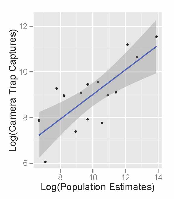
Snapshot Serengeti is really lucky in that many animals have been studied in Serengeti over the years. Meaning that unlike many camera trap surveys, we can actually check our data against a big pile of existing knowledge. In doing so, we can figure out what sorts of things cameras are good at and what they’re not.
Comparing the raw photographic capture rates of major Serengeti herbivores to their population sizes as estimated in the early 2000’s, we see that the cameras do an okay job of reflecting the relative abundance of different species. The scatterplot below shows the population sizes of 14 major herbivores estimated from Serengeti monitoring projects on the x-axis, and camera trap photograph rates of those herbivores on the y-axis. (We take the logarithm of the value for statistical reasons.) There are really more wildebeest than zebra than buffalo than eland, and we see these patterns in the number of photographs taken.
Like we saw the other week, monthly captures shows that we can get a decent sense of how these relative abundances change through time.

So, by comparing the camera trash photos to known data, we see that they do a pretty good job of sketching out some basics about the animals. But the relationship also isn’t perfect.
So, in the end, I think that our Snapshot Serengeti data suggests that cameras are a fantastic tool and that raw photographic capture rates can be used to quickly develop a rough understanding of new places, especially when researchers need to move quickly. But to actually produce specific numbers, say, how many buffalo per square-km there are, we need to dive in to the more complicated statistics. And that’s okay.
A change of scene; jungles
I have just got back from a short (too short!) trip to Costa Rica. I wasn’t sure what to expect from this world famous eco destination but I decided to bring my camera trap with me on the off chance I would be given permission to set it up and capture something new, for me anyway.
My time was split between two distinct ecosystems, lowland rainforest of the Caribbean slope and dry forest of the Guanacaste/Nicoya peninsular. I stayed in protected areas and reserves so the chances of mammal activity was there, unfortunately I had only two or three days in each place which limited the chances of capturing anything somewhat. Hardly scientific I know but I was curious to see what might be out and about after I was tucked up in bed.
Now I am used to the African bushveld, a dry-ish, semi wooded, semi open grassland environment with a sandy substrate. It is easy to see where animals are frequently passing from trampled vegetation and tracks. Placing camera traps and getting results was not too hard. Costa Rica’s rainforests on the other hand was a challenge. The vegetation was thick, lush and resilient to animal passage and finding tracks in the dense leaf litter was impossible. Costa Rica’s dry forests where just as bad. It was the dry season and the trees had lost all their leaves…big leaves that made a thick carpet on the ground covering any tracks and trails.
Needless to say I did not get too many results but taking my time frame and lack of local knowledge into account it is amazing that I got anything. All the animals were at least new to me so gave me a great buzz.
Of the animals I captured peccaries, a type of pig where the most common in the rainforest followed by crab eating raccoons in the dry coastal forests. I captured 1 agouti, 1 paca, 1 probable grison devouring my camera and the most exciting of all an ocelot. Typically the ocelot was the very first capture on the first night. Staying at the Selva Verde lodge I had the help of the resident guide, Ivan and we placed the camera near to the river. I think he was just as thrilled as I was to get an ocelot despite their being the most common of the neo tropical cats.
I hope you enjoy this short video clip, you can see if you look closely that the ocelot is carrying something in its mouth, prey?
A touch of poetry
I’ve been doing a lot of work in Program MARK recently, a software program that enables you to calculate parameters like survival or detectability for animals that are marked and then re-encountered at a later time (I’m trying to see if we can use methods like these on some of the smaller mammals we sight in the camera trap photos). Sounds fun, right? A lot time spent staring at a screen full of numbers, manipulating a parameter here, adding a covariate there, trying to fit more and more appropriate models to the data. Anyhow, I was messing about trying to figure out how to incorporate age-structured temporal variability into my design matrix (don’t worry, I hardly know what all that means either) the other day when I stumbled across something quite delightful — someone has secreted away a small collection of poems about the angst of modeling in the program help files! Statisticians are people after all!
Musings at Midnight
Here I sit before the computer and MARK,
Hoping the circuitry in my brain would spark —
Neurons could fire, light bulbs would flash,
My brain running faster than the 50-yard dash.
And of the billions of models — one of each kind —
H-sub-phi-one-S-slash-t would be the model that I’d find.
Its bias was low, its precision was high,
And no other QAICc was nigh.
Well, back to work. I finish this rhyme,
Having made sure I covaried by writing by time.
Jennifer Ballard.
Biometricians
Vaguely scratching
Numbers wild
Never matching
Counting crows
Or eels electric
Distributions
Parametric?
Badly biased
Or vaguely valid
Significant
Cucumber Salad
Droege, S.
Find that nest!
You’ve got to check out this game: http://nightjar.exeter.ac.uk/story/nightjar_game

Scientists from the University of Exeter are trying to understand camouflage. Specifically, they want to understand how camouflage helps protect animals from being eaten for dinner, and they’re doing this by studying ground nesting birds in South Africa & Zambia.
Like Snapshot Serengeti, these guys use camera traps too, to figure out whose munching on birds and their nests. Unlike Snapshot Serengeti, however, they aren’t asking for help IDing the photos: instead, they’re asking for help figuring out how predators see, and how different types of camouflage work better or worse against predators with different types of vision.
Humans have trichromatic vision, meaning we have three different types of receptors (light sensitive cells in the eye) that can process color: red (longwave), green (mediumwave), and blue (shortwave). Some animals only have two receptor types and can only see one or two colors, whereas other animals have four, allowing them to see wavelengths such as infrared or ultraviolet that are invisible to people. Thus, what camouflages eggs against one predator might not work so well against another predator.
What these researchers have done is create a game that mimics the vision of other predators. So you get to see the world through the eyes of either a genet cat (with dichromatic vision) or a vervet monkey (with trichromatic vision), and “hunt” for birds or their nests in a series of pictures. This helps scientists understand how perception changes among different animals, and how camouflage works against different perception types.
So go check it out! But don’t forget to come back and then help us classify Season 7! We’ll announce its debut on the blog soon!
Data from Afar

Earth, rendered from MODIS data
Look at this picture of the world – it’s blue, it’s green, it’s dynamic. It is covered in swirling clouds beneath which we can see hints of landforms, their shapes and their colors. Satellites tireless orbiting the Earth gathered the information to construct this image. And every pixel of this this awe-inspiring rendition of our planetary home is packed with data on geology, topography, climatology, and broad-scale biological processes.
I still find it funny that I can sit in my office and watch weather patterns in Asia, cloud formation over the Pacific, or even examine the contours of the moon in minute detail, thanks to remote sensing programs. Not that lunar geomorphology is particularly pertinent to lion behavior, at least, in any way we’ve discovered so far. Still, an incredible amount of information on the Serengeti landscape can be collected by remote sensing and incorporated into our research. “Remote sensing” simply refers to gathering information from an object without actually making physical contact with the object itself. Primarily, this involves the use of aerial platforms (some kind of satellite or aircraft) carrying sensor technologies that detect and classify objects by means of propagated signals. Most people are passingly familiar with RADAR (“radio detection and ranging”) and SONAR (“sound navigation and ranging”), both examples of remote sensing technologies where radio waves and sound, respectively, are emitted and information retrieved from the signal bouncing back off of other objects. The broad-scale biotic or abiotic environmental information gathered can then be used in our analyses to help predict and explain patterns of interest. People are using remote sensing to monitor monitoring deforestation in Amazon Basin, glacial features in Arctic and Antarctic regions, and processes in coastal and deep oceans. Here are brief vignettes of several kinds of remote sensing data we draw upon for our own biological studies.

Herbivore distributions overlaid on NDVI readings
NDVI: Normalized Difference Vegetation Index
NDVI is collected using the National Oceanic and Atmospheric Administration (NOAA)’s Advanced Very High Resolution Radiometer and is an assessment of whether a bit of landscape in question contains live green vegetation or not. And yes, it’s far more complicated than simply picking out the color “green”. In live plants, chlorophyll in the leaves absorbs solar radiation in the visible light spectrum as a source of energy for the process of photosynthesis. Light in the near-infrared spectral region, however, is much higher in energy and if the plant were to absorb these wavelengths, it would overheat and become damaged. These wavelengths are reflected away. This means that if you look at the spectral readings from vegetation, live green plants appear relatively dark in the visible light spectral area and bright in the near-infrared. You can exploit the strong differences in plant reflectance to determine their distribution in satellite images. Clever, right? NDVI readings are normalized on a scale of -1 to 1, where negative values correspond to water, values closer to zero indicate barren areas of tundra, desert, or barren rock, and increasingly positive values represent increasing vegetated areas. As you can see in the image above, we have NDVI readings for our study sites which can be used to examine temporal and spatial patterns of vegetation cover, biomass, or productivity — factors important in driving herbivore distribution patterns.

Wildfire occurrence data gathered from MODIS satellites
MODIS: Moderate-resolution Imaging Spectroradiometer
The MODIS monitoring system is being carried in orbit aboard a pair of satellites, the Terra and Aqua spacecraft, launched by NASA in the early 2000s. The two instruments image the entire surface of the Earth every 1 to 2 days, collecting measurements on a range of spectral bands and spatial resolutions. Their readings provide information on large-scale global processes, including pretty much anything that can occur in the oceans, on land, or throughout the lower atmosphere. Many of the beautiful Earth images, such as the one at the head of this post, are constructed using MODIS data. We hope to use MODIS information for the detection and mapping of wildlife fires, which impact organisms at every level of the Serengeti food web.

LiDAR: Apparently, a common misnomer is that “LiDAR” is an acronym for Light Detection and Ranging, while the official Oxford English Dictionary (the be-all-end-all for etymology) maintains that the word is merely a combination of light and radar. Either way, it’s less of a mouthful than the other two techniques just discussed!
LiDAR is quite well-known for its applications in homing missiles and weapons ranging, and was used in the 1971 Apollo 15 mission to map the surface of the moon. We also use this for biology, I promise. What LiDAR does, and does far better than RADAR technology, is to calculate distances by illuminating a target with a laser and measuring the amount of time it takes for the reflected signal to return. High resolution maps can be produced detailing heights of objects and structural features of any material that can reflect the laser, including metallic and non-metallic objects, rocks, rain, clouds, and even, get this, single molecules. There are two types of LiDAR: topographic, for mapping land, and bathymetric, which can penetrate water. To acquire these types of data for your site, you load up your sensors into an airplane, helicopter, or drone and use these aerial platforms to cover broad areas of land. I first became aware of LiDAR from a study that used this technology in South Africa to map lion habitat and correlate landscape features with hunting success. I’ve also seen it used to map habitat for wolves and elk, determine canopy structure, and, interestingly enough, to remotely distinguish between different types of fish (weird, and also really neat). Now we don’t have LiDAR information for the Serengeti, so keep an eye out for anyone who might be able to lend us a couple of small aircraft and some very expensive sensing equipment!
What we’ve seen so far, cont’d.
Playing with data is one of the many things I love about research. Yes, it is super nerdy. I embrace that.
Last week I shared with you the various critters we’re getting to *see* in the Snapshot Serengeti data. Over 100,000 wildebeest photos! Over 4,000 lions! And the occasional really cool rarity like pangolins

Pangolin!
and rhinos.

Rhino!
But the photographs carry a lot more information than just simply what species was caught in the frame. For example, because the photos all have times recorded, we can see how the Serengeti changes through time.
This graph shows the number of daily pictures of wildebeest and buffalo, and how the daily capture rates change through the seasons. Each set of bars represents a different month, starting in July 2010. Wildebeest are in dark green, buffalo in light green. The y-axis is on a square-root scale, meaning that the top is kind of squished: the difference from 30-40 is smaller than the distance from 0-10. Otherwise, we’d either have to make the graph very very tall, or wouldn’t really be able to see the buffalo counts at all.
Buffalo are captured more-or-less evenly across the different months. But the wildebeest show vast spikes in capture rates during the wet season. These spikes in numbers coincide with the migration, when the vast herds of wildebeest come sweeping through the study area.
Now, the number of photos doesn’t directly transfer into the number of wildebeest in the study area, and these aren’t changes in population size, but instead changes in distribution of the wildebeest. But it’s pretty cool that with something as simple as just the number of photographs, we can see these huge changes that accurately reflect what’s going on in the system.
