South Africa, here I come.
Back in October, I wrote about how a grant proposal was turning me into a zombie.
Well, much to my surprise, turns out that my foray into the world of the walking dead was worth the effort. I’ve just heard that the National Science Foundation does, indeed, want to send me to South Africa to carry out this research!
Basically, I’m interested in how the other big carnivores (hyenas, leopards, cheetahs, and wild dogs) manage to live with lions. And I think that one of the keys to their coexistence has to do with how the other carnivores distribute themselves across the landscape to avoid being killed or harassed by lions. Do they avoid huge tracts of land and lose access to the valuable resources within? Or are they able to fine-tune their behavior and still use those areas without getting into trouble?
As you know, I’m using the camera traps to try and figure out these patterns of habitat use by the major carnivores. But that still just tells me what they do in a place (the Serengeti) where there are lions, and I don’t know if the lions are directly causing these patterns. I can’t, for obvious reasons, do an experiment where I take out all the lions and see if the rest of the animals change their behaviors, which would help me identify such a causal relationship.
But in South Africa, there are two virtually identical reserves — they have the same habitat, the same prey animals, and the same carnivores…except that one has lions and one does not. These reserves are right next to each other and surrounded by fencing. So they are pretty much the perfect experimental system where I can actually answer whether or not the patterns we see in predator behavior are caused by lions. What’s even better is that there are already ongoing research projects there that are running camera trap surveys very similar to Snapshot Serengeti. So most of my work will be doing some measurements of the vegetation and working with the researchers in South Africa to compile their data in a way that we can draw these comparisons.

Comparison of Serengeti (left) and Phinda/Mkhuze (right). Phinda and Mkhuze are two virtually identical reserves in South Africa, except that lions have historically been excluded from Mkhuze.
It’s going to be a *lot* of computer work with a *little* bit of getting out into the bush, but the questions are so cool and the ability to effectively isolate the effect of a single top predator (lions) in a natural ecosystem is so rare, that I couldn’t be more excited about it.
The History of Lions

Barbary Lion, BBC
Here’s a great post by the BBC about some genetic work that has just been done to shed light on the evolutionary history of lions. Apparently, it’s a bit tricky reconstructing lion history due to the fact that they don’t fossilize particularly well (generally not conducive conditions in lion habitat) and that humans create giant holes in the record by wiping out entire sub-population.
However, from genetic analyses of living lions and museum specimens, these authors have determined that there are two evolutionary groups of lions – those in India and Central/West Africa and those in Eastern/Southern Africa. This happens to have some interesting implications for lion conservation and reintroduction — check out the article!
Interesting finds from Season 7!
Season 7 is up and running, and we’re already running into some interesting critters!

melanistic serval
No, that’s not a house cat wandering through the middle of the savanna. If you check out the gigantic ears, it appears that we’ve caught sight of a melanistic serval! Melanism involves a genetic mutation that causes the development of dark pigments in the skin, like a reverse albinism. For comparison, these guys normally look like this:

regular ol’ serval
According to our field assistant, Daniel, the serval population is booming in the Serengeti at the moment. Perhaps with so many animals, it’s not entirely unexpected to find one or two odd cases like this.
Let’s see what other interesting finds pop up in the latest season of Snapshot Serengeti!
Season 7
It’s been a long time coming, but it’s really and truly here.
First, we have to reiterate that Season 7 would never have been possible without your help. Last summer, our long-term National Science Foundation funding ran out and we were facing a gap in funding that could have closed down the camera survey forever. We launched the Save Snapshot Serengeti campaign to make sure that Season 7 happened — and because of your support, it did. Thank you, again, for making this project possible in so many ways.
And now! The hard won photos of Season 7 are here.
Season 7 is a big one, running from May 2013 all the way through to the end of November. That’s 7 months! In that time, the long rains faded and the roads became dusty. Stan, whose face you’ve seen so many times checking cams

Stan
began a master’s program in Dar es Salaam, and Norbert took over checking the cameras in his place.

Norbert!
Back in Minnesota, Margaret defended her dissertation and began a new post doc at Harvard working with the Phenocam project. I’ve been frantically analyzing data from Seasons 1-6 to finish my dissertation. And Meredith became the newest member of the Snapshot Serengeti team.
So, stop whatever you’re doing for a few minutes and go check out Season 7. Because really, whose day *isn’t* brightened by photos like this?

Teehee…warthog nose!
Rolling on
Hello! I haven’t written in a while. After I defended my dissertation in December, I’ve been busy getting ready to move to the Boston area. I have now started a research position (technically called a “postdoctoral fellowship”) at Harvard University.

Harvard Science Center
In this new job, I am putting together a new citizen science project. This project will help scientists better understand and forecast the effects of climate change on North American trees and plants. We have cameras up throughout the U.S. and Canada taking automatic pictures of forests, grasslands, shrublands, desserts, and even tundra. There are already several years of images recorded, so it’s a great data set to play with.
In order to understand the seasonality of trees and plants, we talk about “phenology,” which is the timing of when trees and plants go through their various life stages. You can think about a maple tree, for example, which puts out leaf buds in the spring, grows those leaves into a full green canopy, then those leaves start to change color, and eventually they all fall off the tree in the autumn. These phenology events define all sorts of processes that are important to people – ranging from how much carbon trees and plants take out of the air to the timing of seasonal pollen release (which you might care about if you have allergies).

Phenology image looking out over woodland in New Hampshire
Of course, computer algorithms can only do so much, which is where citizen science comes in. The human eye is great at looking at fine details in images and figuring out what’s going on in strange images. For example, one of my colleagues was looking at a measure of greenness in grassland images from Hawaii. This measure was calculated automatically from the images. But something seemed strange. When he went and looked at the individual images themselves, he discovered that there was a common plant that flowered yellow all at once, which changed the greenness in a surprising way.
I’m excited about this new job, but I’m still involved with Snapshot Serengeti. These past couple months, Ali and I have been training Meredith on all the behind-the-scenes image and data processing that goes on both before you see the images and after you’ve classified them. This has slowed down the release of Season 7 (sorry), but ensuring continuity means fewer problems down the line. (By the way, Meredith is a fast learner – it’s just that there’s a lot to learn!) And I’ll still be blogging here periodically.
I’ve had a couple people ask about my dissertation. It’s now published and available online. Note, though, that it doesn’t contain any Snapshot Serengeti content. I was already rather far along in writing it when Snapshot Serengeti launched, so I didn’t have time to include it. We’re working on the first Snapshot Serengeti papers now, though, and we will be sure to let you know when they’re ready to read.
A touch of poetry
I’ve been doing a lot of work in Program MARK recently, a software program that enables you to calculate parameters like survival or detectability for animals that are marked and then re-encountered at a later time (I’m trying to see if we can use methods like these on some of the smaller mammals we sight in the camera trap photos). Sounds fun, right? A lot time spent staring at a screen full of numbers, manipulating a parameter here, adding a covariate there, trying to fit more and more appropriate models to the data. Anyhow, I was messing about trying to figure out how to incorporate age-structured temporal variability into my design matrix (don’t worry, I hardly know what all that means either) the other day when I stumbled across something quite delightful — someone has secreted away a small collection of poems about the angst of modeling in the program help files! Statisticians are people after all!
Musings at Midnight
Here I sit before the computer and MARK,
Hoping the circuitry in my brain would spark —
Neurons could fire, light bulbs would flash,
My brain running faster than the 50-yard dash.
And of the billions of models — one of each kind —
H-sub-phi-one-S-slash-t would be the model that I’d find.
Its bias was low, its precision was high,
And no other QAICc was nigh.
Well, back to work. I finish this rhyme,
Having made sure I covaried by writing by time.
Jennifer Ballard.
Biometricians
Vaguely scratching
Numbers wild
Never matching
Counting crows
Or eels electric
Distributions
Parametric?
Badly biased
Or vaguely valid
Significant
Cucumber Salad
Droege, S.
Data from Afar

Earth, rendered from MODIS data
Look at this picture of the world – it’s blue, it’s green, it’s dynamic. It is covered in swirling clouds beneath which we can see hints of landforms, their shapes and their colors. Satellites tireless orbiting the Earth gathered the information to construct this image. And every pixel of this this awe-inspiring rendition of our planetary home is packed with data on geology, topography, climatology, and broad-scale biological processes.
I still find it funny that I can sit in my office and watch weather patterns in Asia, cloud formation over the Pacific, or even examine the contours of the moon in minute detail, thanks to remote sensing programs. Not that lunar geomorphology is particularly pertinent to lion behavior, at least, in any way we’ve discovered so far. Still, an incredible amount of information on the Serengeti landscape can be collected by remote sensing and incorporated into our research. “Remote sensing” simply refers to gathering information from an object without actually making physical contact with the object itself. Primarily, this involves the use of aerial platforms (some kind of satellite or aircraft) carrying sensor technologies that detect and classify objects by means of propagated signals. Most people are passingly familiar with RADAR (“radio detection and ranging”) and SONAR (“sound navigation and ranging”), both examples of remote sensing technologies where radio waves and sound, respectively, are emitted and information retrieved from the signal bouncing back off of other objects. The broad-scale biotic or abiotic environmental information gathered can then be used in our analyses to help predict and explain patterns of interest. People are using remote sensing to monitor monitoring deforestation in Amazon Basin, glacial features in Arctic and Antarctic regions, and processes in coastal and deep oceans. Here are brief vignettes of several kinds of remote sensing data we draw upon for our own biological studies.

Herbivore distributions overlaid on NDVI readings
NDVI: Normalized Difference Vegetation Index
NDVI is collected using the National Oceanic and Atmospheric Administration (NOAA)’s Advanced Very High Resolution Radiometer and is an assessment of whether a bit of landscape in question contains live green vegetation or not. And yes, it’s far more complicated than simply picking out the color “green”. In live plants, chlorophyll in the leaves absorbs solar radiation in the visible light spectrum as a source of energy for the process of photosynthesis. Light in the near-infrared spectral region, however, is much higher in energy and if the plant were to absorb these wavelengths, it would overheat and become damaged. These wavelengths are reflected away. This means that if you look at the spectral readings from vegetation, live green plants appear relatively dark in the visible light spectral area and bright in the near-infrared. You can exploit the strong differences in plant reflectance to determine their distribution in satellite images. Clever, right? NDVI readings are normalized on a scale of -1 to 1, where negative values correspond to water, values closer to zero indicate barren areas of tundra, desert, or barren rock, and increasingly positive values represent increasing vegetated areas. As you can see in the image above, we have NDVI readings for our study sites which can be used to examine temporal and spatial patterns of vegetation cover, biomass, or productivity — factors important in driving herbivore distribution patterns.

Wildfire occurrence data gathered from MODIS satellites
MODIS: Moderate-resolution Imaging Spectroradiometer
The MODIS monitoring system is being carried in orbit aboard a pair of satellites, the Terra and Aqua spacecraft, launched by NASA in the early 2000s. The two instruments image the entire surface of the Earth every 1 to 2 days, collecting measurements on a range of spectral bands and spatial resolutions. Their readings provide information on large-scale global processes, including pretty much anything that can occur in the oceans, on land, or throughout the lower atmosphere. Many of the beautiful Earth images, such as the one at the head of this post, are constructed using MODIS data. We hope to use MODIS information for the detection and mapping of wildlife fires, which impact organisms at every level of the Serengeti food web.

LiDAR: Apparently, a common misnomer is that “LiDAR” is an acronym for Light Detection and Ranging, while the official Oxford English Dictionary (the be-all-end-all for etymology) maintains that the word is merely a combination of light and radar. Either way, it’s less of a mouthful than the other two techniques just discussed!
LiDAR is quite well-known for its applications in homing missiles and weapons ranging, and was used in the 1971 Apollo 15 mission to map the surface of the moon. We also use this for biology, I promise. What LiDAR does, and does far better than RADAR technology, is to calculate distances by illuminating a target with a laser and measuring the amount of time it takes for the reflected signal to return. High resolution maps can be produced detailing heights of objects and structural features of any material that can reflect the laser, including metallic and non-metallic objects, rocks, rain, clouds, and even, get this, single molecules. There are two types of LiDAR: topographic, for mapping land, and bathymetric, which can penetrate water. To acquire these types of data for your site, you load up your sensors into an airplane, helicopter, or drone and use these aerial platforms to cover broad areas of land. I first became aware of LiDAR from a study that used this technology in South Africa to map lion habitat and correlate landscape features with hunting success. I’ve also seen it used to map habitat for wolves and elk, determine canopy structure, and, interestingly enough, to remotely distinguish between different types of fish (weird, and also really neat). Now we don’t have LiDAR information for the Serengeti, so keep an eye out for anyone who might be able to lend us a couple of small aircraft and some very expensive sensing equipment!
What we’ve seen so far, cont’d.
Playing with data is one of the many things I love about research. Yes, it is super nerdy. I embrace that.
Last week I shared with you the various critters we’re getting to *see* in the Snapshot Serengeti data. Over 100,000 wildebeest photos! Over 4,000 lions! And the occasional really cool rarity like pangolins

Pangolin!
and rhinos.

Rhino!
But the photographs carry a lot more information than just simply what species was caught in the frame. For example, because the photos all have times recorded, we can see how the Serengeti changes through time.
This graph shows the number of daily pictures of wildebeest and buffalo, and how the daily capture rates change through the seasons. Each set of bars represents a different month, starting in July 2010. Wildebeest are in dark green, buffalo in light green. The y-axis is on a square-root scale, meaning that the top is kind of squished: the difference from 30-40 is smaller than the distance from 0-10. Otherwise, we’d either have to make the graph very very tall, or wouldn’t really be able to see the buffalo counts at all.

Buffalo are captured more-or-less evenly across the different months. But the wildebeest show vast spikes in capture rates during the wet season. These spikes in numbers coincide with the migration, when the vast herds of wildebeest come sweeping through the study area.
Now, the number of photos doesn’t directly transfer into the number of wildebeest in the study area, and these aren’t changes in population size, but instead changes in distribution of the wildebeest. But it’s pretty cool that with something as simple as just the number of photographs, we can see these huge changes that accurately reflect what’s going on in the system.
What we’ve seen so far…
As we prepare to launch Season 7 (yes! it’s coming soon! stay tuned!), I thought I’d share with you some things we’ve seen in seasons 1-6.
Snapshot Serengeti is over a year old now, but the camera survey itself has been going on since 2010; you guys have helped us process three years of pictures to date!
First, of the >1.2 million capture events you’ve looked through, about two-thirds were empty. That’s a lot of pictures of grass!

But about 330,000 photos are of the wildlife we’re trying to study. A *lot* of those photos are of wildebeest. From all the seasons so far, wildebeest made up just over 100,000 photos! That’s nearly a third of all non-empty images altogether.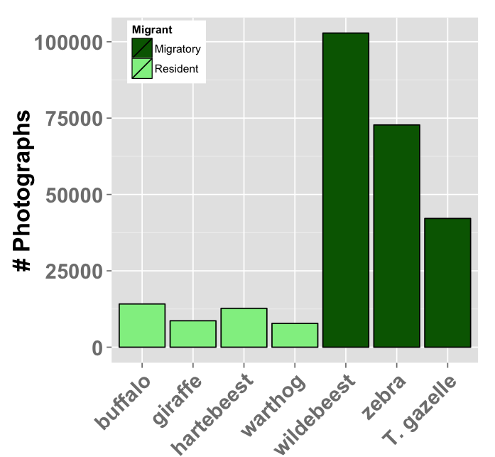
We also get a lot of zebra and gazelle – both of which hang out with the wildebeest as they migrate across the study area. We also see a lot of buffalo, hartebeest, and warthog — all of which lions love to eat.

We also get a surprising number of photos of the large carnivores. Nearly 5,000 hyena photos! And over 4,000 lion photos! (Granted, for lions, many of those photos are of them just lyin’ around.)
Curious what else? Check out the full breakdown below…