
Things are looking up!
I’ve got to echo Margaret’s apology for our sporadic blog posts lately. Things have been a bit hectic for all of us — Dr (!!!) Margaret Kosmala is finishing up her dissertation revisions and moving on to an exciting post-doctoral position at Harvard, our latest addition, Meredith, is finishing up her first semester (finals! ah!), and I’m knee deep in analyses (and snow!).
So,\ please bear with us through the craziness and rest assured that we’ll pick up the blog posts again after the holidays. In the meanwhile, I’ll show you something that got me really excited last week. (Warning: this involves graphs, not cute pictures.)
Last week, I was summarizing some of the Snapshot Serengeti data to present to my committee members. (My committee is the group of faculty members that eventually decide whether my research warrants a PhD, so holding these meetings is always a little nerve-wracking.) As a quick summary, I made this graph of the total number of photographs of the top carnivores. Note that I’m currently only working with data from Seasons 1-3, since we’re having trouble with the timestamps from Seasons 4-6, so the numbers below are about half of what I’ll eventually be able to analyze.
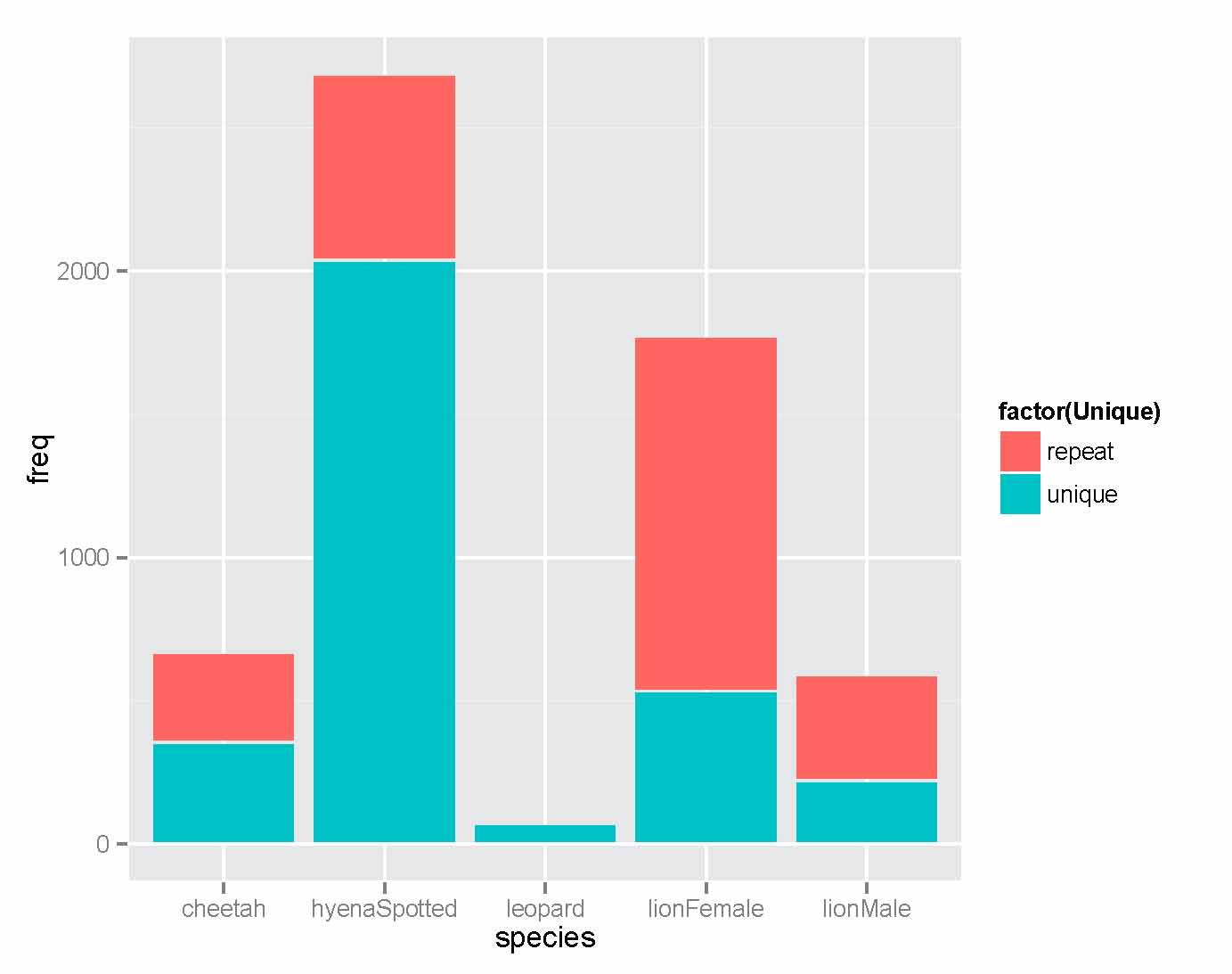
The height of each bar represents the total number of pictures for each species. The color of the bar reflects whether or not a sighting is “unique” or “repeat.” Repeated sightings happen when an animal plops down in front of the camera for a period of time, and we get lots and lots of photos of it. This most likely happens when animals seek out shade to lie in. Notice that lions have wayyyy more repeated sightings percentage-wise than other species. This makes sense — while we do occasionally see cheetahs and hyenas conked out in front of a well-shaded camera, this is a much bigger issue for lions.
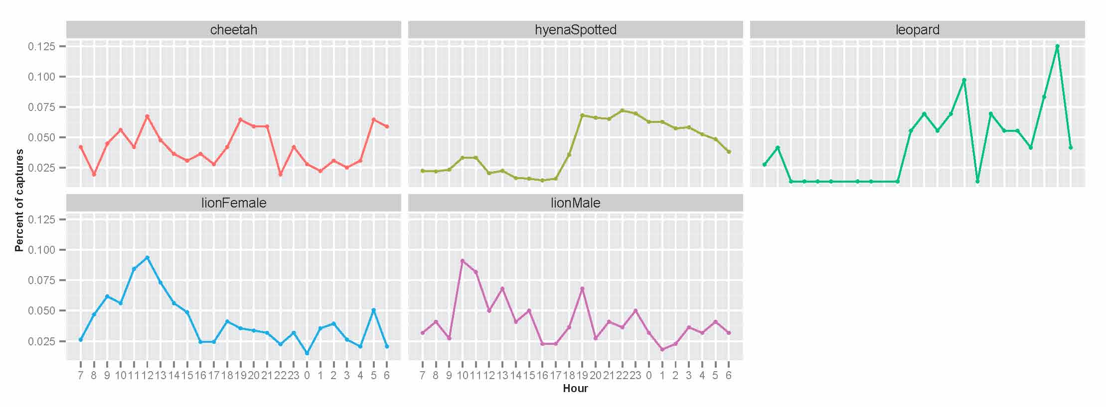
I also dived a little deeper into the temporal patterns of activity for each species. The next graph shows the number of unique camera trap captures of each species for every hour of the day. See the huge spike in lion photos from 10am-2pm? It’s weird, right? Lions, like the other carnivores, are mostly nocturnal….so why are there so many photos of them at midday? Well, these photos are almost always lions who have wandered over for a well-shaded naptime snoozing spot. While there are a fair number of cheetahs who seem to do this too, it doesn’t seem to be as big of a deal for hyenas or leopards.
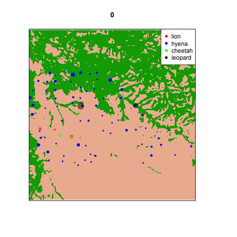
Why is this so exciting? Well, recall how I’ve repeatedly lamented about the way shade biases camera trap captures of lions? Because lions are so drawn to nice, shady trees, we get these camera trap hotspots that don’t match up with our lion radio-collar data. The map below shows lion densities, with highest densities in green, and camera traps in circles. The bigger the circle, the more lions were seen there.

The “lion hotspots” in relatively low density lion areas have been driving me mad all year. These are nice, shady trees that lions are drawn to from up to several kilometers away, and I’ve been struggling to reconcile the lion radio-collar data with the camera trapping data.
What the graphs above suggest, though, is that there likely to be much less bias for hyenas and leopards. Lions are drawn to shade, because they are big and bulky and easily overheated. We see this in the data in the form of many repeated sightings (indicating that lions like to lie down in one spot for hours) and in the “naptime spike” in the timing of camera trap captures that suggest lions seeking out shade trees to go to. Although this remains a bit of an issue for cheetahs, what the graphs above suggest is that using camera traps to understand hyena and leopard activity will be much less biased and much more straightforward — ultimately, much easier than it is for lions. And this is really good news for me.
Analyses galore
Last week I posted an animated GIF of hourly carnivore sightings. To clarify, the map showed patterns of temporal activity across all days over the last 3 years — so the map at 9am shows sites where lions, leopards, cheetahs, and hyenas like to be in general at that time of day (not on any one specific day).
These maps here actually show where the carnivores are on consecutive days and months (the dates are printed across the top). [For whatever reason, the embedded .GIFs hate me; click on the map to open in a new tab and see the animation!]
Keep in mind that in the early days (June-Sept 2010) we didn’t have a whole lot of cameras on the ground, and that the cameras were taken down from Nov 2010-Feb 2011 (so that’s why those maps are empty).

Carnivores captured on any given day across the study area
The day-by-day map is pretty sparse, and in fact looks pretty random. The take-home message for this is that lions, hyenas, cheetahs, and leopards are all *around*, but the chances of them walking past a camera on any given day are kinda low. I’m still trying to find a pattern in the monthly distributions below.

Carnivore captures per month
So this is what I’ve been staring at in my turkey-induced post-Thanksgiving coma. Could be worse!
Let the analyses begin!
Truth be told, I *have* been working on data analysis from the start. It’s actually one of my favorite parts of research — piecing together the story from all the different puzzle pieces that have been collected over the years.
But right now I am knee-deep in taking a closer look at the camera trap data. Since we have *so* many cameras taking pictures every day I want to look at where the animals are not just overall, but from day to day, hour to hour. I’m not 100% sure what analytical approaches are out there, but my first step is to simply visualize the data. What does it look like?
So I’ve started making animations within the statistical programming software R. Here’s one of my first ones (stay tuned over the holidays for more). Each frame represents a different hour on the 24 hour clock: 0 is midnight, 12 is noon, 23 is 11pm, etc. Each dot is sized proportionally to the number of captures of that species at that site at that time of day. The dots are set to be a little transparent so you can see when sites are hotspots for multiple species. [*note: if the .gif isn’t animating for you in the blog, try clicking on it so it opens in a new tab.]
 It’s pretty clear that there are a handful of “naptime hotspots” on the plains. You can bet your boots that those are nice shady trees in the middle of nowhere that the lions really love.
The scourge of Daylight Savings Time
As Ali mentioned, we’re working on figuring out timing issues for all the images in Snapshot Serengeti. Each image has a timestamp embedded in it. And that time is Tanzanian time. You might have noticed that sometimes the time associated with an image doesn’t seem to match the time in the photo — especially a night shot with a day time or a day shot with a night time. We initially shrugged that off, saying that some of the times get messed up when the camera gets attacked by an animal.
But it turns out to be more complicated than that. All the times you see on Snapshot Serengeti — either when you click the rightmost icon below the image on the classify screen, or when you look at a capture in Talk — are on West Greenland (or Brazil) time. Why is that? Well, databases like to try to make things “easy” by converting timezones for you. So when the images got loaded up onto the Zooniverse servers, the Snapshot Serengeti database converted all the times from what it thought was Coordinated Universal Time (UTC) to U.S. Central Time, where both Minneapolis and Chicago are. That would mean subtracting six hours. But since the times are really Tanzanian ones, subtracting six hours sticks us in the middle of the Atlantic Ocean (or in Greenland if we go north or Brazil if we go south).
That wouldn’t be so bad, except for Daylight Savings Time. Tanzania, like everywhere close to the equator, doesn’t bother with it. It doesn’t make sense to mess with your times when sunrise and sunset are pretty much as the same time all year round. However, the ever-helpful database located in the U.S. converted the times as if they experience Daylight Savings Time. So on dates during “standard time,” the Snapshot Serengeti times are off by six hours; subtract six hours to find out the actual time the image was taken. But on dates during daylight savings, the times are off by just five hours.
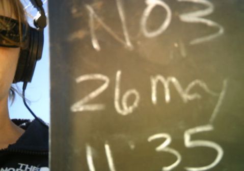
11:35am Tanzanian time. Shown as 4:35pm on Snapshot Serengeti.
And to make things more of a headache for me, those images that got taken during the hour that “disappears” in the spring due to Daylight Savings Time, get tallied as being taken the hour before. This might explain why we get some captures that don’t seem to go together: the images were actually taken an hour apart!
So now I’m focusing on straightening all the timestamps out. And when I do, I’ll ask the Zooniverse developers if we can correct all the times in Snapshot Serengeti so that they’re shown in Tanzanian time. Hopefully we’ll have that all set before Season 7.
By the way, I was able to figure this all out pretty quickly thanks to the awesome blackboard collection that volunteer sisige put together. You can see the actual Tanzanian time on many of the blackboards and confirm that the online time shown below the picture is five or six hours later, depending on the time of year. Many thanks to those of you who tag and comment and put together collections in Talk; what you do is valuable — sometimes in unexpected ways!
Don’t worry!
Deep breath; I promise it will be okay.
By now, many of you have probably seen the one image that haunts your dreams: the backlit photo of the towering acacia that makes the wildebeest in front look tiny, with those two terrible words in big white print across the front — “We’re Done!” Now what are you going to do when you drink your morning coffee?? Need a break from staring at spreadsheets?? Are in desperate need of an African animal fix?? Trust me, I know the feeling.
Deep breath. (And skip to the end if you can’t wait another minute to find out when you can ID Snapshot Serengeti animals again.)
I have to admit that as a scientist using the Snapshot Serengeti data, I’m pretty stoked that Seasons 5 and 6 are done. I’ve been anxiously watching the progress bars inch along, hoping that they’d be done in time for me to incorporate them in my dissertation analyses that I’m finally starting to hash out. Silly me for worrying. You, our Snapshot Serengeti community, have consistently awed us with how quickly you have waded through our mountains of pictures. Remember when we first launched? We put up Seasons 1-3 and thought we’d have a month or so to wait. In three days we were scrambling to put up Season 4. This is not usually the problem that scientists with big datasets have!
Now that Seasons 5 and 6 are done, we’ll download all of the classifications for every single capture event and try to make sense of them using the algorithms that Margaret’s written about here and here. We’ll also need to do a lot of data “cleaning” — fixing errors in the database. Our biggest worry is handling incorrect timestamps — and for whatever reason, when a camera trap gets injured, the time stamps are the first things to malfunction (usually shuttling back to 1970 or into the futuristic 2029). It’s a big data cleaning problem for us. First, one of the things we care about is when animals are at different sites, so knowing the time is important. But also, many of the cameras are rendered non-functional for various reasons – meaning that sometimes a site isn’t taking pictures for days or even weeks. To properly analyze the data, we need to line up the number of animal captures with the record of activity, so we know that a record of 0 lions for the week really means 0 lions, and not just that the camera was face down in the mud.
So, we now have a lot of work in front of us. But what about you? First, Season 7 will be on its way soon, and we hope to have it online in early 2014. But that’s so far away! Yes, so in the meanwhile, the Zooniverse team will be “un-retiring” images like they’ve done in previous seasons. This means that we’ll be collecting more classifications on photos that have already been boxed away as “done.” Especially for the really tricky images, this can help us refine the algorithms that turn your classifications into a “correct answer.”
But there are also a whole bunch of awesome new Zooniverse projects out there that we’d encourage you to try in the meanwhile. For example, this fall, Zooniverse launched Plankton Portal, which takes you on a whole different kind of safari. Instead of identifying different gazelles by the white patches on their bums, you identify different species of plankton by their shapes. Although plankton are small, they have big impacts on the system — as the Plankton Portal scientists point out on their new site, “No plankton = No life in the ocean.”
Wherever you choose to spend your time, know that all of us on the science teams are incredibly grateful for your help. We couldn’t do this without you.
Summary of the Experts
Last week, william garner asked me in the comments to my post ‘Better with experience’ how well the experts did on the about 4,000 images that I’ve been using as the expert-identified data set. How do we know that those expert-identifications are correct?
Here’s how I put together that expert data set. I asked a set of experts to classify images on snapshotserengeti.org — just like you do — but I asked them to keep track of how many they had done and any that they found particularly difficult. When I had reports back that we had 4,000 done, I told them that they could stop. Since the experts were reporting back at different times, we actually ended up doing more than 4,000. In fact, we’d done 4,149 sets of images (captures), and we had 4,428 total classifications of those 4,149 captures. This is because some experts got the same capture.
Once I had those expert classifications, I compared them with the majority algorithm. (I hadn’t yet figured out the plurality algorithm.) Then I marked (1) those captures where experts and the algorithm disagreed, and (2) those captures that experts had said were particularly tricky. For these marked captures, I went through to catch any obvious blunders. For example, in one expert-classified capture, the expert classified the otherBirds in the images, but forgot to classify the giraffe the birds were on! The rest of these marked images I sent to Ali to look at. I didn’t tell her what the expert had marked or what the algorithm said. I just asked her to give me a new classification. If Ali’s classification matched with either the algorithm or the expert, I set hers as the official classification. If it didn’t, then she, and Craig, and I examined the capture further together — there were very few of these.
Huh? What giraffe? Where?
And that is how I came up with the expert data set. I went back this week to tally how the experts did on their first attempt versus the final expert data set. Out of the 4,428 classifications, 30 were marked as ‘impossible’ by Ali, 1 was the duiker (which the experts couldn’t get right by using the website), and 101 mistakes were made. That makes for a 97.7% rate of success for the experts. (If you look at last week’s graph, you can see that some of you qualify as experts too!)
Okay, and what did the experts get wrong? About 30% of the mistakes were what I call wildebeest-zebra errors. That is, there are wildebeest and zebra, but someone just marks the wildebeest. Or there are only zebra, and someone marks both wildebeest and zebra. Many of the wildebeest and zebra herd pictures are plain difficult to figure out, especially if animals are in the distance. Another 10% of the mistakes were otherBird errors — either someone marked an otherBird when there wasn’t really one there, or (more commonly) forgot to note an otherBird. About 10% of the time, experts listed an extra animal that wasn’t there. And another 10% of the time, they missed an animal that was there. Some of these were obvious blunders, like missing a giraffe or eland; other times it was more subtle, like a bird or rodent hidden in the grass.
The other 40% of the time were mis-identifications of the species. I didn’t find any obvious patterns to where the mistakes were; here are the species that were mis-identified:
| Species | Mistakes | Mistaken for |
| buffalo | 6 | wildebeest |
| wildebeest | 6 | buffalo, hartebeest, elephant, lionFemale |
| hartebeest | 5 | gazelleThomsons, impala, topi, lionFemale |
| impala | 5 | gazelleThomsons, gazelleGrants |
| gazelleGrants | 4 | impala, gazelleThomsons, hartebeest |
| reedbuck | 3 | dikDik, gazelleThomsons, impala |
| topi | 3 | hartebeest, wildebeest |
| gazelleThomsons | 2 | gazelleGrants |
| cheetah | 1 | hyenaSpotted |
| elephant | 1 | buffalo |
| hare | 1 | rodents |
| jackal | 1 | aardwolf |
| koriBustard | 1 | otherBird |
| otherBird | 1 | wildebeest |
| vervetMonkey | 1 | guineaFowl |
Better with experience
Does experience help with identifying Snapshot Serengeti images? I’ve started an analysis to find out.
I’m using the set of about 4,000 expert-classified images for this analysis. I’ve selected all the classifications that were done by logged-in volunteers on the images that had just one species in them. (It’s easier to work with images with just one species.) And I’ve thrown out all the images that experts said were “impossible.” That leaves me with 68,535 classifications for 4,084 images done by 5,096 different logged-in volunteers.
I’ve counted the number of total classifications each volunteer has done and given them a score based on those classifications. And then I’ve averaged the scores for each group of volunteers who did the same number of classifications. And here are the results:
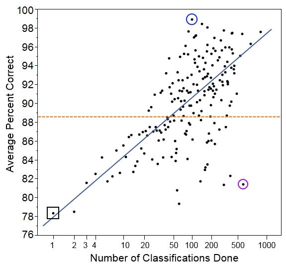
Here we have the number of classifications done on the bottom. Note that the scale is a log scale, which means that higher numbers get grouped closer together. We do this so we can more easily look at all the data on one graph. Also, we expect someone to improve more quickly with each additional classification at lower numbers of classifications.
On the left, we have the average score for each group of volunteers who did that many classifications. So, for example, the group of people who did just one classification in our set had an average score of 78.4% (black square on the graph). The group of people who did two classifications had an average score of 78.5%, and the group of people who did three classifications had an average score of 81.6%.
Overall, the five thousand volunteers got an average score of 88.6% correct (orange dotted line). Not bad, but it’s worth noting that it’s quite a bit lower than the 96.6% that we get if we pool individuals’ answers together with the plurality algorithm.
And we see that, indeed, volunteers who did more classifications tended to get a higher percentage of them correct (blue line). But there’s quite a lot of individual variation. You can see that despite doing 512 classifications in our set, one user had a score of only 81.4% (purple circle). This is a similar rate of success as you might expect for someone doing just 4 classifications! Similarly, it wasn’t the most prolific volunteer who scored the best; instead, the volunteer who did just 96 classifications got 95 correct, for a score of 99.0% (blue circle).
We have to be careful, though, because this set of images was drawn randomly from Season 4, and someone who has just one classification in our set could have already classified hundreds of images before this one. Counting the number of classifications done before the ones in this set will be my task for next time. Then I’ll be able to give a better sense of how the total number of classifications done on Snapshot Serengeti is related to how correct volunteers are. And that will give us a sense of whether people learn to identify animals better as they go along.
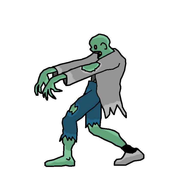
This is what grant applications do
I’ve been working on a federal grant application the last couple of weeks. It’s left me feeling a bit like this:
The grant was originally due this upcoming Thursday, but with the government shutdown showing no signs of ending, who knows what will happen? The National Science Foundation’s website is unavailable during the furlough, meaning that nobody can submit applications. So we’ve all been granted an unexpected extension, but we’re not sure until when.
The grant I’m applying for is called the Doctoral Dissertation Improvement Grant. It’s an opportunity for Ph.D. students to acquire funding to add on a piece to their dissertation that they wouldn’t otherwise be able to do. I’m applying for funds to go down to South Africa and work with a couple of folks from the conservation organization Panthera to collate data from two sites with long-term carnivore research projects. Their research team currently has camera surveys laid out in two reserves in Kwazulu-Natal, South Africa: Phinda Private Game Reserve and Mkhuze Game reserve. Now, the cool thing about these reserves is that they are small, fenced, and pretty much identical to each other…except that lions have been deliberately excluded from Mkhuze.
Now, one of the biggest frustrations of working with large carnivores is that I can’t experimentally isolate the processes I’m studying. If I want to know how lions affect the ranging patterns and demography of hyenas, well, I should take out all the lions from a system and see what happens to the hyenas. For obvious reasons, this is never going to happen. But the set-up in Phinda and Mkhuze is the next best thing: by holding everything else constant – habitat, prey – I can actually assess the effect of lions on the ranging and dynamics of hyenas, cheetahs, and leopards by comparing the two reserves.

Camera surveys (yellow dot = camera) in Serengeti (left) and Phinda/Mkhuze (right).
So, that’s what I’m working on non-stop until whenever it turns out to be due. Because this would be a really cool grant to get. I’m currently working on analyzing some of the camera trap data from Seasons 1-4 and hope to share some of the results with you next week. Until then, I’m going to continue to be a bit of a zombie.
Handling difficult images
From last week’s post, we know that we can identify images that are particularly difficult using information about classification evenness and the fraction of “nothing here” votes cast. However, the algorithm (and really, all of you volunteers) get the right answer even on hard images most of the time. So we don’t necessary want to just throw out those difficult images. But can we?
Let’s think about two classes of species: (1) the common herbivores and (2) carnivores. We want to understand the relationship between the migratory and non-migratory herbivores. And Ali is researching carnivore coexistence. So these are important classes to get right.
First the herbivores. Here’s a table showing the most common herbivores and our algorithm’s results based on the expert-classified data of about 4,000 images. “Total” is the total number of images that our algorithm classified as that species, and “correct” is the number of those that our experts agreed with.
| species | migratory | total | correct | % correct |
| wildebeest | yes | 1548 | 1519 | 98.1% |
| zebra | yes | 685 | 684 | 100% |
| hartebeest | no | 252 | 244 | 96.8% |
| buffalo | no | 219 | 215 | 98.2% |
| gazelleThomsons | yes | 200 | 189 | 94.5% |
| impala | no | 171 | 168 | 98.3% |
We see that we do quite well on the common herbivores. Perhaps we’d wish for Thomsons gazelles to be a bit higher (Grants gazelles are most commonly mis-classified as Thomsons), but these results look pretty good.
If we wanted to be conservative about our estimates of species ranges, we could throw out some of the images with high Pielou scores. Let’s say we threw out the 10% most questionable wildebeest images. Here’s how we would score. (Note that I didn’t do the zebra, since they’d be at 100% again, no matter how many we dropped.) The columns are the same as the above table, except this time, I’ve listed the threshold Pielou score used to throw out 10% of the images of that species.
| species | Pielou cutoff | total | correct | % correct |
| wildebeest | 0.60 | 1401 | 1389 | 99.1% |
| hartebeest | 0.73 | 228 | 223 | 97.8% |
| buffalo | 0.76 | 198 | 198 | 100% |
| gazelleThomsons | 0.72 | 180 | 175 | 97.2% |
| impala | 0.86 | 155 | 153 | 98.7% |
We do quite a bit better with our Thomsons gazelle and increase the accuracy of all the other species at least a little. But do we sacrifice anything throwing out data like that? If wildebeest make up a third of our images and we have a million images, then we’re throwing away 33,000 images(!), but we still have another 300,000 left to do our analyses. One thing we will look at in the future is how much dropping the most questionable images affects estimates of species ranges. I’m guessing that for wildebeest it won’t be much.
What if we did the same thing for Thomsons gazelle or impala? We would expect about 50,000 images of each of those per million images. Throwing out 5,000 images still leaves us with 45,000, which seems like it might be enough for many analyses.
Now let’s look at the carnivore classifications from the expert-validated data set:
| species | total | correct | % correct |
| hyenaSpotted | 55 | 55 | 100% |
| lionFemale | 18 | 18 | 100% |
| cheetah | 6 | 6 | 100% |
| serval | 6 | 6 | 100% |
| leopard | 3 | 3 | 100% |
| jackal | 2 | 2 | 100% |
| lionMale | 1 | 1 | 100% |
| aardwolf | 1 | 1 | 100% |
| batEaredFox | 1 | 0 | 0% |
| hyenaStriped | 1 | 0 | 0% |
Wow! You guys sure know your carnivores. The two wrong answers were the supposed bat-eared fox that was really a jackal and the supposed striped hyena that was really an aardwolf. These two wrong answers had high Pielou scores: 0.77 and 0.83 respectively.
Judging by this data set, about 2.5% of all images are carnivores, which gives us about 25,000 carnivore images for every million we collect. That’s a lot of great data on these relatively rare animals! But it’s not so much that we want to throw any of it away. Fortunately, we won’t have to. We can use the Pielou score to have an expert look at the most difficult images.
Let’s say Ali wants to be very confident of her data. She can choose the 20% most difficult carnivore images — which is only about 5,000 per million images, and she can go through them herself. Five thousand images is nothing to sneeze at, of course, but the work can be done in a single day of intense effort.
In summary, we might be able to throw out some of the more difficult images (based on Pielou score) for the common herbivores without losing much coverage in our data. Further analyses are needed, though, to see if doing so is worthwhile and whether we lose anything by throwing out so many correct answers. For carnivores, the difficult images can be narrowed down sufficiently that an expert can double-check them by hand.
Certainty score
Back in June, I wrote about algorithms I was working on to take the volunteer data and spit out the “correct” classification of for each image. First, I made a simple majority-rules algorithm and compared its results to several thousand classifications done by experts. Then, when the algorithm came up with no answer for some of the images (because there were no answers in the majority), I tried a plurality algorithm, which just looked to see which species got the most votes, even if it didn’t get more than half the votes. It worked well, so I’m using the plurality algorithm going forward.
One of the things I’ve been curious about is whether we can detect when particular images are “hard.” You know what I mean by hard: animals smack up in front of the camera lens, animals way back on the horizon, animals with just a tip of the ear or a tuft of tail peeking onto the image from one side, animals obfuscated by trees or the dark of night.
So how can we judge “hard”? One way is to look at the “evenness” of the volunteer votes. Luckily, in ecology, we deal with evenness a lot. We frequently want to know what species are present in a given area. But we also want to know more than that. We want to know if some species are very dominant in that area or if species are fairly evenly distributed. For example, in a famous agricultural ecology paper*, Cornell entomologist Richard Root found that insect herbivore (pest) species on collard greens were less even on collards grown in a big plot with only other collards around versus on those grown in a row surrounded by meadow plants. In other words, the insect species in the big plot were skewed toward many individuals of just a few species, whereas in the the meadow rows, there were a lot more species with fewer individuals of each species.
We can adopt a species evenness metric called “Pielou’s evenness index” (which, for you information theorists, is closely related to Shannon entropy.)
[An aside: I was surprised to learn that this index is named for a woman: Dr. Evelyn Chrystalla Pielou. Upon reflection, this is the first time in my 22 years of formal education (in math, computer science, and ecology) that I have come across a mathematical term named for a woman. Jacqueline Gill, who writes a great paleo-ecology blog, has a nice piece honoring Dr. Pielou and her accomplishments.]
Okay, back to the Pielou index: we can use it to judge how even the votes are. If all the votes are for the same species, we can have high confidence. But if we have 3 votes for elephant and 3 votes for rhino and 3 votes for wildebeest and 3 votes for hippo, then we have very low confidence. The way the Pielou index works out, a 0 means all the votes are for the same species (high skew, high confidence) and a 1 means there are at least two species and they all got the same number of votes (high evenness, low confidence). Numbers in between 0 and 1 are somewhere between highly skewed (e.g. 0.2) and really even (e.g. 0.9).
Another way we could measure the difficulty of an image is to look at how many people click “nothing here.” I don’t like it, but I suspect that some people use “nothing here” as an “I don’t know” button. Alternatively, if animals are really far away, “nothing here” is a reasonable choice. We might assume that the percentage of “nothing here” votes correlates with the difficulty of the image.
I calculated the Pielou evenness index (after excluding “nothing here” votes) and the fraction of “nothing here” votes for the single-species images that were classified by experts. And then I plotted them. Here I have the Pielou index on the x-axis and the fraction of “nothing here” votes on the y-axis. The small pink dots are the 3,775 images that the algorithm and the experts agreed on, the big blue dots are the 84 images that the plurality algorithm got wrong, and the open circles are the 29 images that the experts marked as “impossible.” (Click to enlarge.)
 And sure enough, we see that the images the algorithm got wrong had relatively high Pielou scores. And the images that were “impossible” had either high Pielou scores or a high fraction of “nothing here” votes (or both). I checked out the four anomalies over on the left with a Pielou score of zero. All four were unanimously voted as wildebeest. For the three “impossibles,” both Ali and I agree that wildebeest is a reasonable answer. But Ali contends that the image the algorithm got wrong is almost certainly a buffalo. (It IS a hard image, though — right up near the camera, and at night.)
So we do seem to be able to get an idea of which images are hardest. But note that there are a lot more correct answers with high Pielou scores and high “nothing here” fractions than errors or “impossibles”. We don’t want to throw out good data, so we can’t just ignore the high-scorers. But we can attach a measure of certainty to each of our algorithm’s answers.
—
