
Craig at Bryant Lake Bowl TONIGHT
If you’re in the Twin Cities area, Craig will be giving a Café Scientifique talk (“The Short and Happy Life of a Serengeti Lion”) at the Bryant Lake Bowl at 7pm tonight.
If you’ve never been to one, the Café Scientifique talks are loads of fun. They’re informal presentations by scientists in a bar setting. Eat, drink, laugh, science. Can’t get much better than that.

Certainty score
Back in June, I wrote about algorithms I was working on to take the volunteer data and spit out the “correct” classification of for each image. First, I made a simple majority-rules algorithm and compared its results to several thousand classifications done by experts. Then, when the algorithm came up with no answer for some of the images (because there were no answers in the majority), I tried a plurality algorithm, which just looked to see which species got the most votes, even if it didn’t get more than half the votes. It worked well, so I’m using the plurality algorithm going forward.
One of the things I’ve been curious about is whether we can detect when particular images are “hard.” You know what I mean by hard: animals smack up in front of the camera lens, animals way back on the horizon, animals with just a tip of the ear or a tuft of tail peeking onto the image from one side, animals obfuscated by trees or the dark of night.
So how can we judge “hard”? One way is to look at the “evenness” of the volunteer votes. Luckily, in ecology, we deal with evenness a lot. We frequently want to know what species are present in a given area. But we also want to know more than that. We want to know if some species are very dominant in that area or if species are fairly evenly distributed. For example, in a famous agricultural ecology paper*, Cornell entomologist Richard Root found that insect herbivore (pest) species on collard greens were less even on collards grown in a big plot with only other collards around versus on those grown in a row surrounded by meadow plants. In other words, the insect species in the big plot were skewed toward many individuals of just a few species, whereas in the the meadow rows, there were a lot more species with fewer individuals of each species.
We can adopt a species evenness metric called “Pielou’s evenness index” (which, for you information theorists, is closely related to Shannon entropy.)
[An aside: I was surprised to learn that this index is named for a woman: Dr. Evelyn Chrystalla Pielou. Upon reflection, this is the first time in my 22 years of formal education (in math, computer science, and ecology) that I have come across a mathematical term named for a woman. Jacqueline Gill, who writes a great paleo-ecology blog, has a nice piece honoring Dr. Pielou and her accomplishments.]
Okay, back to the Pielou index: we can use it to judge how even the votes are. If all the votes are for the same species, we can have high confidence. But if we have 3 votes for elephant and 3 votes for rhino and 3 votes for wildebeest and 3 votes for hippo, then we have very low confidence. The way the Pielou index works out, a 0 means all the votes are for the same species (high skew, high confidence) and a 1 means there are at least two species and they all got the same number of votes (high evenness, low confidence). Numbers in between 0 and 1 are somewhere between highly skewed (e.g. 0.2) and really even (e.g. 0.9).
Another way we could measure the difficulty of an image is to look at how many people click “nothing here.” I don’t like it, but I suspect that some people use “nothing here” as an “I don’t know” button. Alternatively, if animals are really far away, “nothing here” is a reasonable choice. We might assume that the percentage of “nothing here” votes correlates with the difficulty of the image.
I calculated the Pielou evenness index (after excluding “nothing here” votes) and the fraction of “nothing here” votes for the single-species images that were classified by experts. And then I plotted them. Here I have the Pielou index on the x-axis and the fraction of “nothing here” votes on the y-axis. The small pink dots are the 3,775 images that the algorithm and the experts agreed on, the big blue dots are the 84 images that the plurality algorithm got wrong, and the open circles are the 29 images that the experts marked as “impossible.” (Click to enlarge.)
 And sure enough, we see that the images the algorithm got wrong had relatively high Pielou scores. And the images that were “impossible” had either high Pielou scores or a high fraction of “nothing here” votes (or both). I checked out the four anomalies over on the left with a Pielou score of zero. All four were unanimously voted as wildebeest. For the three “impossibles,” both Ali and I agree that wildebeest is a reasonable answer. But Ali contends that the image the algorithm got wrong is almost certainly a buffalo. (It IS a hard image, though — right up near the camera, and at night.)
So we do seem to be able to get an idea of which images are hardest. But note that there are a lot more correct answers with high Pielou scores and high “nothing here” fractions than errors or “impossibles”. We don’t want to throw out good data, so we can’t just ignore the high-scorers. But we can attach a measure of certainty to each of our algorithm’s answers.
—
March of the Elephants
When you think of elephants, you may immediately think of their defining characteristics: trunks, big ears, tusks. Or you may think about how they live in large family groups and are very social. You may even think about the story of the blind men and the elephant. You probably don’t think about them as engineers of their ecosystem. But they are.
Elephants are native to the Serengeti ecosystem, but Serengeti elephants were likely all killed off for ivory in the 1800’s. At least, there weren’t any recorded there until the middle of the twentieth century when they started moving back in again. In the 1960’s they migrated in from both the north and the south, and by 1970 there were over 3,000 elephants in the Serengeti. Things got rocky for elephants again in the 1980’s as severe poaching reduced their numbers in Serengeti National Park to around 500. In 1988, elephants were given CITES endangered species status and worldwide trade in ivory was banned. This was good news for Serengeti elephants and their numbers rebounded again into the thousands.
These ups and downs in elephant population have allowed scientists to study the impact elephants have on their environment. I’ve written before about how the rainfall patterns in the Serengeti affect grasses, and about the role that fire plays. Elephants have their greatest impact on trees. Elephants eat both grasses and trees, but depend on trees for food during the dry season.
In the first half of the twentieth century, the number of trees per hectare was slowly declining across the Serengeti. But starting in the 1970’s, the number of trees rapidly increased. Scientists believe that the initial decrease in trees was due to the the disease rinderpest. Rinderpest killed off the majority of Serengeti’s wildebeest, allowing the grass to grow tall, and fueling huge, strong fires. These fires killed most tree seedlings, meaning that as trees died, they were not being replaced. When rinderpest was halted, the wildebeest population exploded, and the wildebeest kept the grass short and the fires smaller, allowing trees to gain a foothold once more.
Okay, but what about elephants? Well, elephants eat trees — especially small, tender saplings and regrowth from trees damaged by fire. In the 1980’s, while poaching was particularly severe on the Tanzanian side of Serengeti (Serengeti National Park), the Kenyan part of Serengeti (Maasai Mara) mounted a strong anti-poaching effort and kept its elephant numbers high. Across the Serengeti, the trees were increasing, but in the Maasai Mara there were also a lot of elephants. It turns out that in the Maasai Mara, the trees didn’t increase like they did across the border in Tanzania where the elephants had been greatly reduced. Instead the high number of elephants in the Maasai Mara is keeping tree numbers down, despite the reduction in fire intensity.
So elephants are key players in maintaining what scientists call “alternative stable states” in the Serengeti. While there are plenty of elephants once again in the Tanzanian part of the Serengeti, they don’t reduce the higher tree numbers; only fire can do that. But on the Kenyan side of the border, tree numbers remain low because elephants there have been continuously eating saplings; the tree population cannot increase because of the constant elephant pressure. The key difference between the two areas is simply their history.
I think the fourth blind man should get extra credit.
The Fourth reached out an eager hand,
And felt about the knee
“What most this wondrous beast is like
Is mighty plain,” quoth he:
“‘Tis clear enough the Elephant
Is very like a TREE!”

Analysis of ‘Save Snapshot Serengeti’
I did some analysis of what happened during our recent crowdfunding campaign that I want to share.
But first, I want to note a couple things that do not appear in the numbers. Several Snapshot Serengeti fans told us that they wanted to donate, but could not. This was because the Indiegogo site is set up to only accept major credit cards, and will not accept PayPal payments for campaigns (like ours) that send money to non-profits. As many folks outside the U.S. do not have credit cards, this was a barrier. We were unfortunately unable to figure out an alternative method of donation during the campaign, and as a result, a number of you couldn’t donate (or get the perks). And we’re sorry for that; lesson learned.
There were also several people who found our campaign after it had ended. They, too, couldn’t donate via the Indiegogo site. But we do have a webpage set up to accept any future gifts you might like to make. Donations go directly to the University of Minnesota Foundation; simply write “Snapshot Serengeti” in the text field after checking the “yes” box, and we’ll get the money.
And now for the numbers.
We raised $36,324 on Indiegogo, with 701 donors contributing. Of these 701, about a quarter (187) provided a mailing address for their perks. These 187 donors hail from 18 countries and 155 cities, most of them in the United States. We had donations from 27 U.S. states plus the District of Colombia. Here are some maps of where they are. Don’t forget that this is just a quarter of our generous donors! (And also, I just fell in love with MultiPlottr. It took me about a minute to make these maps.)

World map of (some) donor locations.

Close-up of the U.S. and Canada

Close-up of Europe
When we look over time, we see that some interesting things happened. This graph looks a bit busy, but hang in there while I explain it. (And many thanks to Rob Simpson, who helped put this graph together.) Click for a larger version.
 Along the bottom, we have the days of the campaign, starting on July 14 and running to August 9. The dots along the lines are daily dots. The green line shows the total dollar amount raised that day, and you can see the dollar values on the left side of the graph. The red line shows the total number of (unique) visitors to the Snapshot Serengeti site on that day. And I got Indiegogo to send me the data on visitors to the Indiegogo webpage; that’s the yellow line. You can see the values for the red and yellow lines on the right side of the graph.
So what do we see? Here are some things I’ve noticed; maybe you can point out some others. Our initial donations came from our hardcore supporters in the first few days – those of you who read this blog or have liked us on Facebook. The National Geographic article that came out the same day was cool, but didn’t have any links to our campaign for several days.
On July 26, we sent out a newsletter to everyone who’s ever worked on Snapshot Serengeti, announcing Season 6 and our crowdfunding campaign. You can see an immediate uptick in donations (green line) that remains elevated for the next few days. Traffic to Snapshot Serengeti (red line) also increases, but not by a lot. On July 29, we got some coverage at KSTP, our favorite local Minnesota TV station, which may have contributed a little.
But the big event was the following day, when the Zooniverse sent out a newsletter to all of its users. You can see the impact. Lots of folks rushed over to check out Snapshot Serengeti (red line), some of them also checked out the Indiegogo page (yellow line) and 107 of them contributed $4,700 (green line).
All that activity, helped secure us a spot on Indiegogo’s front page on August 1. You can see that for the next few days, visits to our Indiegogo site (yellow line) – and funding (green line) – increased, while attention over at Snapshot Serengeti itself waned. This suggests that being on Indiegogo’s front page was useful and helped keep donations flowing.
On August 4, National Geographic gave us some more great coverage, this time with appropriate links to our campaign. And on August 5, a piece I wrote about the campaign was published on a blog that is frequented by scientists interested in crowdfunding. Both things appeared to give us a boost.
On August 6, we marked down the damaged camera traps, and had a bunch of takers. We also had coverage on BoingBoing the same day, but they initially linked to our About page, so I’m not sure how much impact that had on our fundraising.
It was August 8, our second-to-last day, that sealed the deal. We made Indiegogo’s top “Last Chance” projects. And the Zooniverse sent out another newsletter asking for help getting us the last part of the way to our goal. And the Zoonites (Zoonorians? Zooners?) responded. That day, 219 people gave almost $10,000!
Thanks again to everyone who contributed and also to those who tried but weren’t able.
Heating up and keeping cool
I’m just returning from a lovely vacation in Maine, where the air was cool and the crowds few and far between. It may not always be that way.
It’s no secret that over the next several decades, the average temperature in the United States (and in many parts of the world) is going to increase. That means warmer summers, both in the hot parts of the country and in the more northerly regions where people typically go in the summer to cool off. As the summer weather get warmer, more people may head north on vacation, or they may go further north than before. We can expect animals to try to compensate for warmer weather, too.

A hermit crab in a Maine tidal pool. Kinda makes you want to cool off with some Seafloor Explorer, doesn’t it?
The first week of August I was in Minneapolis for the annual meeting of the Ecological Society of America, and I spent Thursday sitting in on two symposiums: “Warming Consumers and their Prey: General Principles and Applications for How Temperature Affects Trophic Interactions” in the morning and “Rapid Climate Change and Species Range Shifts: Observations, Predictions, and Management” in the afternoon.
The morning session was about how warming climate may influence interactions between plants and animals and between animal predators and animal prey. It is not an easy topic, as the relationships among species are complex, and scientists are only starting to understand how warming will affect single species directly (that is, if they don’t interact with other species). One speaker pointed out that while some species might normally adapt to warming or move to cooler areas, having other species around might prevent that adaptation or movement. For example, if you overheat easily and your plant food does not move northward as the climate warms, you cannot very easily move northward to adjust to the changing climate. Another speaker showed that we should think about maximum summer temperatures and minimum winter temperatures, rather than average annual temperature (as is typically done); plants and animals are likely to experience the greatest impact of climate change when they experience unusually hot or unusually cold conditions.
The afternoon session was equally interesting. One speaker talked about how over the past few decades, the ranges of plants and animals studied all over the world are moving towards the poles (north in the northern hemisphere, south in the southern hemisphere), up mountains, and down into deeper water (for aquatic organisms). Another talked about using information from botanical gardens and commercial plant nurseries to understand where some plant species can live and reproduce, even if they’re not native to that area to begin with; this is useful information for predicting how plants might change their ranges in the future.
Regional climate models for East Africa do not suggest that the area is going to get much warmer in the next decades. However, the climate will get more variable, with wetter wet seasons and more frequent droughts. That’s one of the reasons we want to run Snapshot Serengeti for many years. By collecting data over a decade or more, we’re likely to catch at least one drought year and at least one very wet rainy season. If the Serengeti’s future holds more of these extreme climate years, the data from Snapshot Serengeti will help us determine what will happen to the various animals that live there — and in other parts of Africa.
See where other Snapshotters are
The Zooniverse has just launched Zooniverse Live, which puts pinpoints up on a world map when anyone classifies an image in Snapshot Serengeti (or any other Zooniverse project). We’ve got the yellow dots. The site uses your IP address to locate your general vicinity, which works pretty well, but sometimes your internet traffic is routed in surprising ways. For example, Zooniverse Live seems to think I’m in Fountain Hills, Arizona, rather than in northern Virginia. Give it a try: classify an image on Snapshot Serengeti and then watch (quickly!) as your image scrolls up along the side of the page on Zooniverse Live. Did it get your location right?

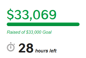
We did it! You did it! (Thanks!)
We have made our fundraising goal of $33,000. Our cameras will keep running through the rest of this year, and we’re laying plans to keep them going after that. Thank you so much to each of you who contributed to the campaign (And thank you, too, to those of you who just shared the link, or who tried, but couldn’t due to Indiegogo’s limited payment options.)
We’re not quite done – there’s still a day left and any donations we receive will still go towards the costs of operating the camera trap network. If today goes exceptionally well, then we might even be able to expand the network of camera. The good news, though, is that YOU DID IT and Snapshot Serengeti will continue far into the future.
National Geographic has put together another article for your enjoyment, this time based on Snapshot Serengeti. It’s got 18 animated GIFs based on the sets of three images you see when you classify. Have a look for a Friday smile.
And thank you again for bringing smiles to our faces.
Save the Memes
You have to check this out. Zooniverse has put together a hilarious web site called Save the Memes. It’s a light-hearted way of spreading the story about our Save Snapshot Serengeti campaign. And while it’s good for that… it’s perhaps a little distracting for us scientists, too!

Give it a go with some pre-selected images. Or, you can turn your favorite Snapshot Serengeti image into a meme from the Talk pages now using the “Meme This!” button.
Unanticipated events and the need for long-term studies
In 1994, a terrible disease ripped through the Serengeti, killing lion after lion. By the end of the year, a third of the lions in the Serengeti were dead. The culprit was a virus known as canine distemper, and lions that died of the disease did not die quietly. The symptoms were clear to any observer: facial twitching, disorientation, and eventually convulsive seizures.
The lions in Craig’s study area were not spared, but the data he had been collecting over the previous decades proved invaluable in understanding what happened in 1994.

Using archived blood samples that had originally been taken for genetic analysis, Craig and his colleagues were able to go back and test for a number of viruses. The earliest year blood had been sampled was 1984, but because some of the lions sampled had been ten years old or older, he was able to infer information about when lions had been exposed to viruses as early as 1970.
They found that there had been previous outbreaks of canine distemper in the lions in 1977 and 1981. Because the lions had been studied then, he knew that these outbreaks had not caused large die-offs like the one that occurred in 1994. Instead, he found that by 1994, essentially all lions in Serengeti were free from canine distemper antibodies, meaning that none of the lions had any immunity to the disease. This widespread lack of immunity and a mutation in the virus were thought to have caused so many deaths.
The lion population recovered after the 1994 outbreak. Just years later, though, two “silent” outbreaks hit the population in 1999 and 2006. Unlike the 1994 outbreak, these ones were not noticed at the time because few lions died. They were only detected through blood sample testing. An analysis of the archived blood samples finally revealed the major difference between the canine distemper outbreak that led to massive death and those that did not. High death rates in the 1994 outbreak were due to the simultaneous infection with another disease — a protozoan parasite known as Babesia — that becomes increasingly common during and after major droughts. When Babesia is absent, lions contract canine distemper, but their immune systems fight it and they become immune. When lions are also infected with Babesia, they cannot fight off the canine distemper virus as easily, and more of them get sick and die.
The long-term lion data was also instrumental in understanding the spread of canine distemper in the 1994 outbreak. The disease showed up sporadically in the study area prides, suggesting that lions acquired the disease from an outside source, rather than spreading it from one lion to another. Sophisticated analyses revealed that the origin of the outbreak was likely in domesticated dogs in the human settlements around the Serengeti ecosystem. Further, it is likely that lions acquired the disease repeatedly from hyenas. Hyenas move great distances, use human-inhabited areas around the Serengeti more than lions do, and interact with lions at kills.
Scientists cannot predict major droughts. Nor can they predict wildlife disease outbreaks. It isn’t possible to recreate major droughts with experiments in vast wilderness areas. Nor is it ethical to introduce novel diseases into natural areas in order to understand more about the disease. It is ONLY through long-term research projects like the Serengeti Lion Project that we acquire the data necessary to understand what happens in nature during disease outbreaks, droughts, and other rare, but important events.
Ideally we would like to run Snapshot Serengeti for at least a decade. We want to be able to capture some drought years in our data set, and some years with unusually wet dry seasons. We want our cameras to be running when the next unexpected disease outbreak occurs — in lions or in other species. To those of you have already contributed to our crowd-funding campaign, a heartfelt thank you. If you haven’t yet, and are able, please consider a donation.
To read more about canine distemper, Babesia, and Serengeti lions, check out:
More lions at National Geographic
In addition to the main feature story on the Serengeti lions that I wrote about on Wednesday, there are a number of lion extras at National Geographic Magazine, too.
The article “Living With Lions” talks about the challenges of lion conservation, and brings up some topics I’ve written about before, including fences and trophy hunting.
There’s an interactive map, where you can see the fragmentation of wild lions. The Serengeti (‘C’ on the map) is one of only a handful of strongholds that contain at least 1,000 lions.
There’s a short interview with Michael Nichols, the photographer for the stories, and a fabulous slideshow of images that he took. (Although I have to say that I always think lions look very strange in black and white.)
And there’s a high-resolution download of this image of Serengeti lion cubs you could use for your desktop background if you wanted.

