
Analysis of ‘Save Snapshot Serengeti’
I did some analysis of what happened during our recent crowdfunding campaign that I want to share.
But first, I want to note a couple things that do not appear in the numbers. Several Snapshot Serengeti fans told us that they wanted to donate, but could not. This was because the Indiegogo site is set up to only accept major credit cards, and will not accept PayPal payments for campaigns (like ours) that send money to non-profits. As many folks outside the U.S. do not have credit cards, this was a barrier. We were unfortunately unable to figure out an alternative method of donation during the campaign, and as a result, a number of you couldn’t donate (or get the perks). And we’re sorry for that; lesson learned.
There were also several people who found our campaign after it had ended. They, too, couldn’t donate via the Indiegogo site. But we do have a webpage set up to accept any future gifts you might like to make. Donations go directly to the University of Minnesota Foundation; simply write “Snapshot Serengeti” in the text field after checking the “yes” box, and we’ll get the money.
And now for the numbers.
We raised $36,324 on Indiegogo, with 701 donors contributing. Of these 701, about a quarter (187) provided a mailing address for their perks. These 187 donors hail from 18 countries and 155 cities, most of them in the United States. We had donations from 27 U.S. states plus the District of Colombia. Here are some maps of where they are. Don’t forget that this is just a quarter of our generous donors! (And also, I just fell in love with MultiPlottr. It took me about a minute to make these maps.)

World map of (some) donor locations.

Close-up of the U.S. and Canada

Close-up of Europe
When we look over time, we see that some interesting things happened. This graph looks a bit busy, but hang in there while I explain it. (And many thanks to Rob Simpson, who helped put this graph together.) Click for a larger version.
 Along the bottom, we have the days of the campaign, starting on July 14 and running to August 9. The dots along the lines are daily dots. The green line shows the total dollar amount raised that day, and you can see the dollar values on the left side of the graph. The red line shows the total number of (unique) visitors to the Snapshot Serengeti site on that day. And I got Indiegogo to send me the data on visitors to the Indiegogo webpage; that’s the yellow line. You can see the values for the red and yellow lines on the right side of the graph.
So what do we see? Here are some things I’ve noticed; maybe you can point out some others. Our initial donations came from our hardcore supporters in the first few days – those of you who read this blog or have liked us on Facebook. The National Geographic article that came out the same day was cool, but didn’t have any links to our campaign for several days.
On July 26, we sent out a newsletter to everyone who’s ever worked on Snapshot Serengeti, announcing Season 6 and our crowdfunding campaign. You can see an immediate uptick in donations (green line) that remains elevated for the next few days. Traffic to Snapshot Serengeti (red line) also increases, but not by a lot. On July 29, we got some coverage at KSTP, our favorite local Minnesota TV station, which may have contributed a little.
But the big event was the following day, when the Zooniverse sent out a newsletter to all of its users. You can see the impact. Lots of folks rushed over to check out Snapshot Serengeti (red line), some of them also checked out the Indiegogo page (yellow line) and 107 of them contributed $4,700 (green line).
All that activity, helped secure us a spot on Indiegogo’s front page on August 1. You can see that for the next few days, visits to our Indiegogo site (yellow line) – and funding (green line) – increased, while attention over at Snapshot Serengeti itself waned. This suggests that being on Indiegogo’s front page was useful and helped keep donations flowing.
On August 4, National Geographic gave us some more great coverage, this time with appropriate links to our campaign. And on August 5, a piece I wrote about the campaign was published on a blog that is frequented by scientists interested in crowdfunding. Both things appeared to give us a boost.
On August 6, we marked down the damaged camera traps, and had a bunch of takers. We also had coverage on BoingBoing the same day, but they initially linked to our About page, so I’m not sure how much impact that had on our fundraising.
It was August 8, our second-to-last day, that sealed the deal. We made Indiegogo’s top “Last Chance” projects. And the Zooniverse sent out another newsletter asking for help getting us the last part of the way to our goal. And the Zoonites (Zoonorians? Zooners?) responded. That day, 219 people gave almost $10,000!
Thanks again to everyone who contributed and also to those who tried but weren’t able.
Lions, cheetahs, and dogs, oh my! (Continued)
Last month, I wrote about how, despite lions killing cheetah cubs left and right, they don’t seem to be suppressing cheetah population size like they do for wild dogs. And, that despite all this killing, that cheetahs don’t seem to be avoiding lions – but I didn’t have radio-collar data for wild dogs.
Well, now I do!
Although we’ve had collared lions continuously since 1984, Serengeti cheetahs and wild dogs were only collared from 1985-1990. We worked with Tim Caro, former director of the cheetah project, to access the historic cheetah data a year ago, but it was only a month ago that we finally tracked down the historic wild dog data. Thanks to a tip by a former Frankfurt Zoological Society employee, we found the data tucked away in the recesses of one of their Serengeti-based storage containers – and Craig braved a swarm of very angry bees to retrieve it!
The good news is that the data was totally worth it. Just like we suspected, even though cheetahs didn’t seem to be avoiding lions, wild dogs were. This map shows lion densities in the background, with cheetah (in brown dots) and wild dog (black triangles) locations overlaid on the lion densities.
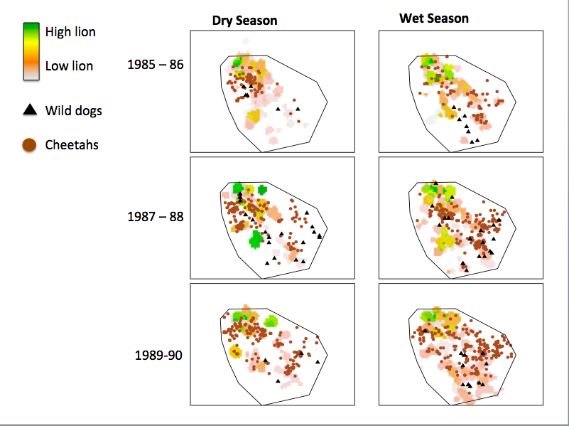
Lions, cheetahs, and wild dogs from when all three species were radio-collared in Serengeti.
It’s a pretty cool contrast. Even though lions kill cheetah cubs left and right, cheetahs do not avoid lions, nor do their populations decline as lions increase. In sharp contrast, wild dogs do avoid lions, and their populations also drop as lions increase. Now, that’s not to say that there weren’t other factors influencing the decline of wild dogs in Serengeti, but across Africa, this pattern seems to hold.
Speaking of wild dogs, has any one seen any in Season 6?
Lions, cheetahs, and dogs, oh my! Part 2.
Last week, we left off with this crazy biological paradox: lions kill cheetah cubs left and right, yet as the Serengeti lion population tripled over the last 40 years, cheetah numbers remained stable.
As crazy as it sounds, it seems that that even though lions kill cheetah cubs left and right, it doesn’t really matter for cheetah populations. There are a number of reasons this could be. For example, cheetahs are able to have cubs again really quickly after they lose a litter, so it doesn’t take long to “replace” those lost cubs. It’s also possible that lions might only be killing cubs that would probably die from another source – say, cubs that would otherwise have died from starvation, or cubs that might have been killed by hyenas. Whatever the reason, what we’re seeing is that lions killing cheetah cubs doesn’t have an effect on the total number of cheetahs in the area.
I think this might hold true for other animals, not just cheetahs. It’s a bit of a weird concept to wrap your head around – that being killed, which is really bad if you’re that individual cheetah, doesn’t actually matter as much for the larger population – but it’s one that seems to be gaining traction among ecologists who study how different species live together in the natural world. Specifically, ecologists are getting excited about the role that behavior plays in driving population dynamics.
Most scientists have studied this phenomenon in predator-prey systems – say, wolves and elk, or wolf spiders and “leaf bugs”.

Wolf spider. Photo from Wikipedia.org.

“Leaf bug” from the Miridae family. Photo from Wikipedia.org.
What scientists are discovering is that predators can suppress prey populations not by eating lots of prey, but by causing the prey to change their behavior. Unlike many spiders, wolf spiders actively hunt their prey – sometimes lurking in ambush, other times chasing their prey for some distance. To avoid being eaten, leaf bugs may avoid areas where wolf spiders have lots of hiding places from which to stage an ambush, or leaf bugs may avoid entire patches of land that have lots of wolf spiders. If these areas are the same ones that have lots of mirid bug food, then they’ve effectively lost their habitat. Sound familiar?
Back to Africa – what does this mean for wild dogs and cheetahs? Interestingly enough, lions do not displace cheetahs from large areas of the Serengeti. We’ve discovered this in part from historic radio-collar data that was collected simultaneously on both species in the late 1980’s. Below is a map that shows average lion density across the study area. Green indicates areas with higher densities. The black “+” symbols show where cheetah were tracked within the same study area. They are overwhelmingly more likely to be found in areas with lots of lions. This is because that is where the food is – and cheetahs are following their prey, regardless of the risk of encountering a lion. The Snapshot Serengeti data confirm this – cheetahs are way more likely to be caught on cameras inside lion territories.
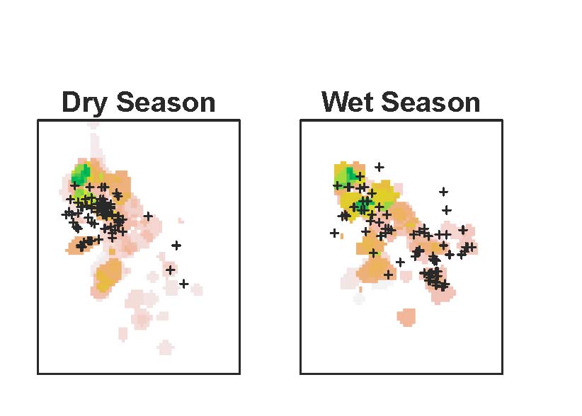
Lion density is mapped per 1km x 1km grid cell. High density areas shown in green, lower in pale orange/gray. Cheetah locations are the black +’s.
Unfortunately, we don’t have radio-collar data on the Serengeti wild dogs from the 1980’s. But we do have radio-collar data for the wild dogs that have been living in the larger Serengeti ecosystem for the past 8 years. As you can see in the map below, wild dogs regularly roam within just 30km of the lion study area. But they don’t settle there – instead, wild dogs remain in hills to the east of Serengeti – where there are local people (who kill wild dogs), but very few lions.

Other researchers in east and southern Africa are starting to pick up on the same patterns in their parks. From Tanzania, to Botswana, to South Africa, researchers are finding that wild dogs get kicked out of really large, prime areas by lions…but that cheetahs do not. What they’re finding (since they have all these animals GPS-collared) is that cheetahs are responding to lions at a very immediate scale. Instead of avoiding habitats that have lions, cheetahs maintain a “safe” distance from the lions – allowing them to use their preferred habitats, but still minimize their risk of getting attacked.
Carnivore researchers are only really just beginning to explore the role of behavior in driving population-level suppression, but I think that there’s good reason to believe that large scale displacement, or other behaviors, for that matter, have greater effects on population numbers of cheetahs and wild dogs, as well as other “subordinate” carnivores – not just in African ecosystems but in systems around the world. It’s a new way of thinking about how competing species all live together in one place, but it’s one that might change the way we approach carnivore conservation for threatened species.
Lions, Cheetahs, and Dogs, Oh My! Part 1.
By now it’s no secret that lions are kind of mean – and that if you are any other carnivore living in the Serengeti, you’d probably prefer a lion-less world. No tawny, muscle-bound foes to steal your food, kill your cubs, chase you around…life would be easy! You’d have plenty of food, your cubs would grow up strong, and your numbers would increase.
Or would they?
It certainly makes sense that all the nasty things that lions do to other carnivores should add up to limit their numbers. Lions are responsible for nearly 30% of wild dog deaths, and over 50% of cheetah deaths! On top of that, they steal food that cheetahs and wild dogs have worked hard to get – and might not have the energy to get again. Researchers are pretty sure that more lions means fewer wild dogs in two ways: 1) In reserves where there are more lions, there are fewer wild dogs, and 2) When lion numbers increase through time, wild dog populations decline.
The same has generally been believed about cheetahs, and some research from the 1990s suggested that reserves with more lions had fewer cheetahs. But as I started digging into the data from Serengeti, I saw a different, quite unexpected, story.
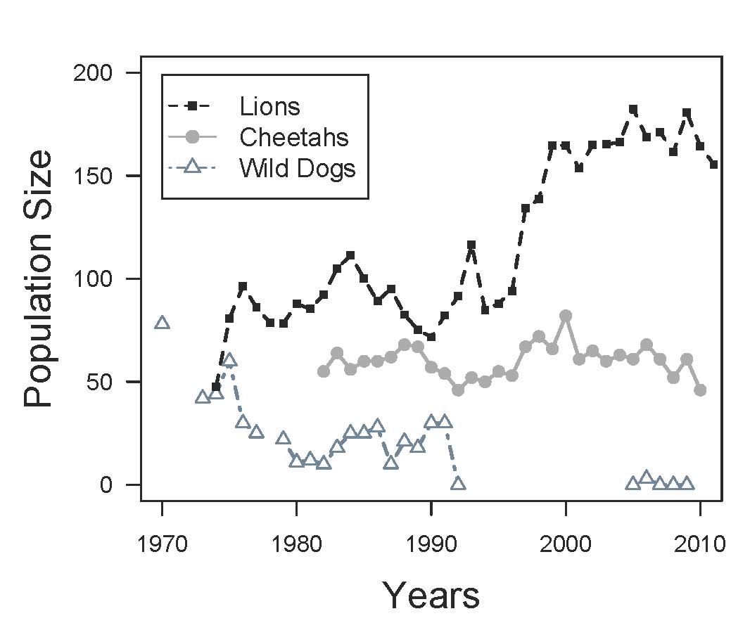
The number of lions, cheetahs, and wild dogs from 1970 onwards. Wild dogs disappeared from the ecosystem from 1992 through 2005.
Lions, cheetahs, and wild dogs were all monitored by long-term projects for a number of years. This graph shows their population sizes since the 1960s. The increase in lions is pretty clear – lions have nearly tripled in the last 40 years, largely due to increases in wildebeest. Wild dogs disappeared from the study area. Now, their final disappearance was due in large part to disease, but it’s possible that lions didn’t help matters. In sharp contrast, the cheetah population has stayed pretty much the same. Sure, there are some ups and downs, but on average, the population has been holding steady over the last 40 years.
Wait a minute, if lions are really bad for cheetahs, then why haven’t cheetah populations declined in the Serengeti? How can they possibly be holding steady when lion numbers have tripled? What is going on???
It’s a good question. Tune in next week for an answer!
The trouble with shade
Who knew that shade could be so problematic? A couple of weeks ago, I wrote about how shade seems to be my biggest obstacle in reconciling how the cameras see the world vs. what is actually going on. My job is to figure out how to make things right.
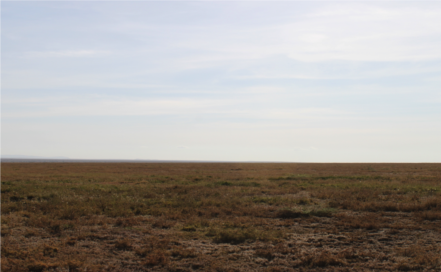
To start with, the camera traps are up on trees. Mostly. As you know, the cameras are on a rough grid layout – 225 grid cells, each 5km2 (2.236km on each side) — covering a total of 1,125 km2 of Serengeti’s center. This kind of design makes sure that we are covering enough of the landscape to capture the bigger picture of animal distributions and movements. Each camera is roughly at the center of each grid cell – on the closes suitable tree to that center point. Some trees are big and shady; some are small and spindly. In the woodlands, there are trees everywhere; on the plains, the camera-trap tree can be the only tree for miles. And sometimes there are no trees at all, and here the cameras get put up on metal poles.


These different habitats are important to capture. I think that animals might behave very differently in areas with lots of trees than they do in areas with very few trees. When it comes to the aggressive interactions between carnivores, for example, trees, shrubs, and tall grass provide great hiding places for the smaller species. It’s like trying to hide from someone you don’t like in an empty room vs. in a really huge, crowded shopping mall.
It’s a lot harder to hide from lions here
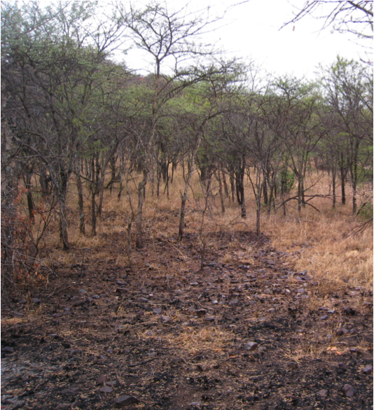
…than here
The problem is that camera traps work better in some habitats than others – at least for certain species. Say you are a huge, muscle-bound lion. Even standing is tiring in the Serengeti heat, and you spend your days breathing heavily even at rest. You like shade. A lot. If you are out in the open plains, a single shade tree will stick out for miles, and you’ll probably work your way to it. Chances are, that tree has a camera. In the woodlands, though, there are lots of trees. And the camera trap could be on any one of them. So even if you’re searching for shade, the chances of you walking past the camera trap in the woodland are far smaller – just because there are so many trees to choose from.
Here’s a map of the study area – green shows more densely wooded areas, whereas yellow marks the plains. Camera traps that have captured lions are shown with circles; the bigger the circle, the more lions were seen at that trap. I know for a fact that there are more lions in the northern half of that map than in the southern half, but the lions out on the plains seem to really like getting their picture taken!
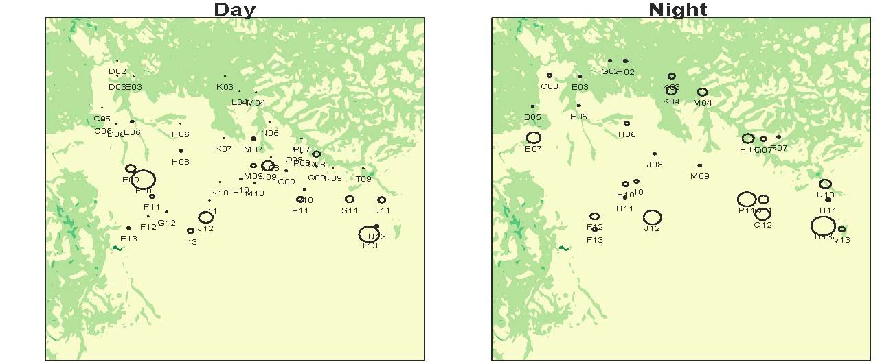
The pattern looks a little better at night than in the day, but it’s not perfect. So perhaps shade isn’t the only thing affecting how these cameras “see” lions in different habitats.
As depressing as this problem seems at first glance, I’m optimistic that we can solve it (enter Kibumbu’s new GPS collar!), but those methods are material for another day. In the meanwhile, what else do you think might be going on that attracts lions, or other animals to trees, besides shade?
Cute Baby Elephant
I hope you’ve been having fun with the new Season 5 images. I have. It’s been about a week since we went live with Season 5, and we’re making good progress. It took under two weeks to go through the first three seasons in December. (We had some media attention then and lots of people checking out the site.) It took about three weeks to finish Season 4 in January. According to my super science-y image copy-and-paste method, it may take us about two months to do Season 5:
 And that’s fine. But I was curious about who’s working on Season 5. The Talk discussion boards are particularly quiet, with almost no newbie questions. So is everyone working on Season 5 a returnee? Or do we have new folks on board?
I looked at the user data from a data dump done on Sunday. So it includes the first 5 or so days of Season 5. In total, there are 2,000 volunteers who had contributed to 280,000 classifications by Sunday! I was actually quite amazed to see that 6% of the classifications are being done by folks not logged in. Is that because they’re new people trying out the site — or because there are some folks who like to classify without logging in? I can’t tell.
But I can compare Season 5 to Season 4. We had 8,300 logged-in volunteers working on Season 4. Of all the classifications, 9% were done by not-logged-in folks. That suggests we have fewer newcomers so far for Season 5. But then we get to an intriguing statistic: of those 2,000 volunteers working on Season 5 in its first five days, 33% of them did not work on Season 4 at all! And those 33% apparently new folks have contributed 50% of the (logged-in) classifications!
So what’s going on? Maybe we’re getting these new volunteers from other Zooniverse projects that have launched since January. Maybe they’re finding us in other ways. (Have you seen that the site can be displayed in Finnish in addition to Polish now?) But in any case, welcome everyone and I hope you spot your favorite animal.
Me, I found this super cute baby elephant just the other day:

Space and time
If you are a nerd like me, the sheer magnitude of questions that can be addressed with Snapshot Serengeti data is pretty much the coolest thing in the world. Though, admittedly, the jucy lucy is a close second.
The problem with these really cool questions, however, is that they take some rather complicated analyses to answer. And there are a lot of steps along the way. For example, ultimately we hope to understand things like how predator species coexist, how the migration affects resident herbivores, and how complex patterns of predator territoriality coupled with migratory and resident prey drive the stability of the ecosystem… But we first have to be able to turn these snapshots into real information about where different animals are and when they’re there.
That might sound easy. You guys have already done the work of telling us which species are in each picture – and, as Margaret’s data validation analysis shows, you guys are really good at that. So, since we have date, time, and GPS information for each picture, it should be pretty easy to use that, right?
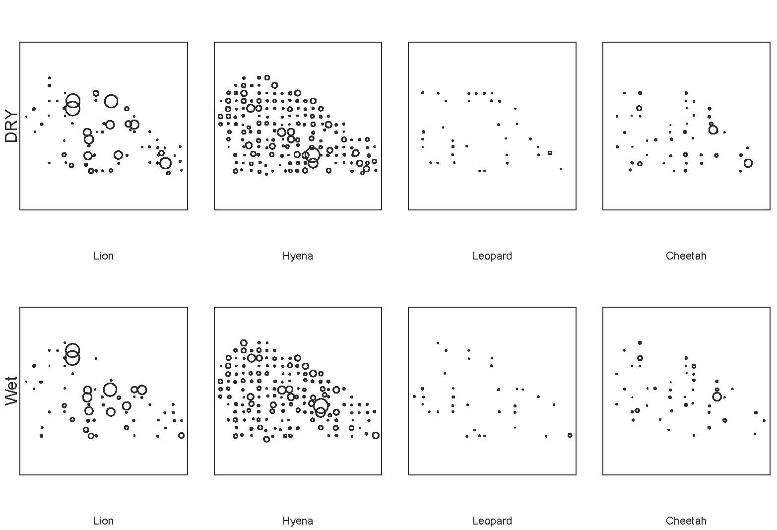
Sort of. On one hand, it’s really easy to create preliminary maps from the raw data. For example, this map shows all the sightings of lions, hyenas, leopards, and cheetahs in the wet and dry seasons. Larger circles mean that more animals were seen there; blank spaces mean that none were.
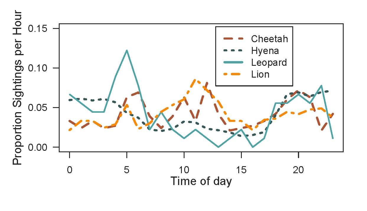
And it’s pretty easy to map when we’re seeing animals. This graph shows the number of sightings for each hour of the day. On the X-axis, 0 is midnight, 12 is noon, 23 is 11pm.
So we’ve got a good start. But then the question becomes “How well do the cameras reflect actual activity patterns?” And, more importantly, “How do we interpret the camera trap data to understand actual activity patterns?”
For example, take the activity chart above. Let’s look at lions. We know from years and years of watching lions, day and night, that they are a lot more active at night. They hunt, they fight, they play much more at night than during the day. But when we look at this graph, we see a huge number of lion photos taken between hours 10:00 to 12:00. If we didn’t know anything about lions, we might think that lions were really active during that time, when in reality, they’ve simply moved 15 meters over to the nearest tree for shade, and then stayed there. Because we have outside understanding of how these animals move, we’re able to identify sources of bias in the camera trapping data, and account for them so we can get to the answers we’re really looking for.
So far, shade seems to be our biggest obstacle in reconciling how the cameras see the world vs. what is actually going on. I’ve just shown you a bit about how shade affects camera data on when animals are active – next week I’ll talk more about how it affects camera data on where animals are.

Hard to find a better place to nap…
Plurality algorithm
On Wednesday, I wrote about how well the simple algorithm I came up with does against the experts. The algorithm looks for species that have more than 50% of the votes in a given capture (i.e. species that have a majority). Commenter Tor suggested that I try looking at which species have the most votes, regardless of whether they cross the 50% mark (i.e. a plurality). It’s a great idea, and easy to implement because any species that has more than 50% of the vote ALSO has the plurality. Which means all I have to do is look at the handful of captures that the majority algorithm had no answer for.
You can see why it might be a good idea in this example. Say that for a particular capture, you had these votes:
| 10 | impala |
| 4 | gazelleThomsons |
| 4 | dikDik |
| 3 | bushbuck |
You’d have 21 votes total, but the leading candidate, impala, would be just shy of the 11 needed to have a majority. It really does seem like impala is the likely candidate here, but my majority algorithm would come up with “no answer” for this capture.
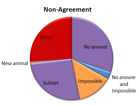
So I tried out Tor’s plurality algorithm. The good news is that 57% of those “no answers” got the correct answer with the plurality algorithm. So that brings our correct percentage from 95.8% to 96.6%. Not bad! Here’s how that other 3.4% shakes out:
So now we have a few more errors. (About a quarter of the “no answers” were errors when the plurality algorithm was applied.) And we’ve got a new category called “Ties”. When you look for a plurality that isn’t over 50%, there can be ties. And there were. Five of them. And in every case the right answer was one of the two that tied.
And now, because it’s Friday, a few images I’ve stumbled upon so far in Season 5. What will you find?


Algorithm vs. Experts
Recently, I’ve been analyzing how good our simple algorithm is for turning volunteer classifications into authoritative species identifications. I’ve written about this algorithm before. Basically, it counts up how many “votes” each species got for every capture event (set of images). Then, species that get more than 50% of the votes are considered the “right” species.
To test how well this algorithm fares against expert classifiers (i.e. people who we know to be very good at correctly identifying animals), I asked a handful of volunteers to classify several thousand randomly selected captures from Season 4. I stopped everyone as soon as I knew 4,000 captures had been looked at, and we ended up with 4,149 captures. I asked the experts to note any captures that they thought were particularly tricky, and I sent these on to Ali for a final classification.
Then I ran the simple algorithm on those same 4,149 captures and compared the experts’ species identifications with the algorithm’s identifications. Here’s what I found:
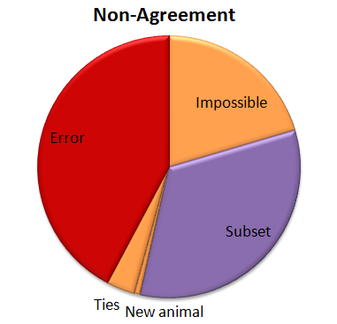
 For a whopping 95.8% of the captures, the simple algorithm (due to the great classifying of all the volunteers!) agrees with the experts. But, I wondered, what’s going on with that other 4.2%. So I had a look:
 Of the captures that didn’t agree, about 30% were due to the algorithm coming up with no answer, but the experts did. This is “No answer” in the pie chart. The algorithm fails to come up with an answer when the classifications vary so much that there is no single species (or combination if there are multiple species in a capture) that takes more than 50% of the vote. These are probably rather difficult images, though I haven’t looked at them yet.
Another small group — about 15% of captures was marked as “impossible” by the experts. (This was just 24 captures out of the 4,149.) And five captures were both marked as “impossible” and the algorithm failed to come up with an answer; so in some strange way, we might consider these five captures to be in agreement.
Just over a quarter of the captures didn’t agree because either the experts or the algorithm saw an extra species in a capture. This is labeled as “Subset” in the pie chart. Most of the extra animals were Other Birds or zebras in primarily wildebeest captures or wildebeest in primarily zebra captures. The extra species really is there, it was just missed by the other party. For most of these, it’s the experts who see the extra species.
Then we have our awesome, but difficulty-causing duiker. There was no way for the algorithm to match the experts because we didn’t have “duiker” on the list of animals that volunteers could choose from. I’ve labeled this duiker as “New animal” on the pie chart.
Then the rest of the captures — just over a quarter of them — were what I’d call real errors. Grant’s gazelles mistaken for Tommies. Buffalo mistaken for wildebeest. Aardwolves mistaken for striped hyenas. That sort of thing. They account for just 1.1% of all the 4,149 captures.
I’ve given the above Non-agreement pie chart some hideous colors. The regions in purple are what scientists call Type II errors, or “false negatives.” That is, the algorithm is failing to identify a species that we know is there — either because it comes up with no answer, or because it misses extra species in a capture. I’m not too terribly worried about these Type II errors. The “Subset” ones happen mainly with very common animals (like zebra or wildebeest) or animals that we’re not directly studying (like Other Birds), so they won’t affect our analyses. The “No answers” may mean we miss some rare species, but if we’re analyzing common species, it won’t be a problem to be missing a small fraction of them.
The regions in orange are a little more concerning; these are the Type I errors, or “false positives.” These are images that should be discarded from analysis because there is no useful information in them for the research we want to do. But our algorithm identifies a species in the images anyway. These may be some of the hardest captures to deal with as we work on our algorithm.
And the red-colored errors are obviously a concern, too. The next step is to incorporate some smarts into our simple algorithm. Information about camera location, time of day, and identification of species in captures immediately before or following a capture can give us additional information to try to get that 4.2% non-agreement even smaller.
Living with lions
A few weeks ago, I wrote about how awful lions are to other large carnivores. Basically, lions harass, steal food from, and even kill hyenas, cheetahs, leopards, and wild dogs. Their aggression usually has no visible justification (e.g. they don’t eat the cheetahs they kill), but can have devastating effects. One of my main research goals is to understand how hyenas, leopards, cheetahs, and wild dogs survive with lions. As I mentioned the other week, I think the secret may lie in how these smaller carnivores use the landscape to avoid interacting with lions.
Top predators (the big ones doing the chasing and killing) can create what we call a “landscape of fear” that essentially reduces the amount of land available to smaller predators. Smaller predators are so afraid of encountering the big guys that they avoid using large chunks of the landscape altogether. One of my favorite illustrations of this pattern is the map below, which shows how swift foxes restrict their territories to the no-man’s land between coyote territories.
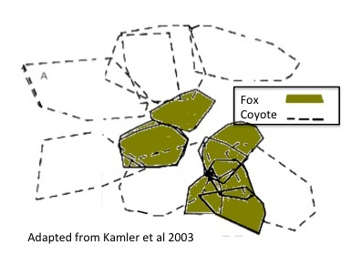
A map of coyote and swift fox territories in Texas. Foxes are so afraid of encountering coyotes that they restrict their territories into the spaces between coyote ranges.
The habitat inside the coyote territories is just as good, if not better, for the foxes, but the risk of encountering a coyote is too great. By restricting their habitat use to the areas outside coyote territories, swift foxes have essentially suffered from habitat loss, meaning that they have less land and fewer resources to support their population. There’s growing evidence that this effective habitat loss may be the mechanism driving suppression in smaller predators. In fact, this habitat loss may have larger consequences on a population than direct killing by the top predator!
While some animals are displaced from large areas, others may be able to avoid top predators at a much finer scale. They may still use the same general areas, but use scent or noise to avoid actually running into a lion (or coyote). This is called fine-scale avoidance, and I think animals that can achieve fine-scale avoidance, instead of suffering from large-scale displacement, manage to coexist.
The camera traps are, fingers crossed, going to help me understand at what scale hyenas, leopards, cheetahs, and wild dogs avoid lions. My general hypothesis is that if these species are generally displaced from lion territories, and suffer effective habitat loss, their populations should decline as lion populations grow. If instead they are able to use the land within lion territories, avoiding lions by shifting their patterns of habitat use or changing the time of day they are active, then I expect them to coexist with lions pretty well.
So what have we seen so far? Stay tuned – I’ll share some preliminary results next week!
#####
Map adapted from: Kamler, J.F., Ballard, W.B., Gilliland, R.L., and Mote, K. (2003b). Spatial relationships between swift foxes and coyotes in northwestern Texas. Canadian Journal of Zoology 81, 168–172.
