
Friday Favorites
In case you’re not aware of it, Snapshot Serengeti is still live. (Or I should say, live again, as it was down for a few days following the completion of Season 4.) The pictures up now are all from Season 4, but the ones of nothing but grass have been removed. So every picture should have something to see in it. We are still recording all the classifications that are made, so your classifications still count.
However, we think we have enough classifications for Season 4 to be able to get science out of it. So if you’re looking to really make an impact science-wise, try out one of the other Zooniverse projects. My personal favorites are Seafloor Explorer and Old Weather. (But if you’re really just loving the fuzzy animal pix, we understand if you want to hang out on Snapshot.)
Ali tells me that Season 5 is in transit! A hard drive with hundreds of thousands of images is somewhere between Arusha, Tanzania, and Saint Paul, Minnesota. We’ll be working on it soon to get it ready for you to classify.
Meanwhile, here are some lovely snapshots to tide you over:


Sequestration, Science, and Snapshot Serengeti
Even if you live outside the U.S., it’s been hard to miss the arrival of the dreaded sequester. However, the impact of sequestration on science research doesn’t get a lot of attention in the general din. The U.S. government funds almost all of the nation’s basic science research, which means science research that doesn’t have an immediate application like creating a new medicine or figuring out how to grow crops to withstand drought.
Much of ecology research is basic. In Snapshot Serengeti, we’re interested in learning how a large assemblage of animals coexist and use the landscape. The results will not have an immediate impact on how the Serengeti is managed, but we hope it will help inform conservation management decisions down the line.

Worth funding?
Most of the nation’s basic research – and much applied research – is being cut by approximately 8%. Now, science funding hasn’t been doing all that well over the past couple decades anyway. And now things are getting worse. Snapshot Serengeti and its parent organization, the Lion Research Center, are mainly funded by the National Science Foundation (NSF), which announced recently that it will award 1,000 fewer grants this year than anticipated.
You may remember that in January, we were working hard on a grant proposal to keep our cameras rolling past the end of 2012. The way the process works is that each proposal gets evaluated on whether it is good, well-planned, and worthwhile science and either gets recommended for funding or rejected. To give you an idea, in our division of the NSF, 16% of proposals got recommended for funding last year.
But it doesn’t end there. Each year the NSF gets many more good, well-planned, and worthwhile proposals than it can fund. So it ranks them. And then it starts funding them, starting at the top and moving down the list, until it runs out of money. Of the recommended proposals, NSF expected to be able to fund just the top 22% of them this year.
And with sequestration, that pot of available money just got even smaller.
What that means for our proposal isn’t clear yet. If the sequester sticks, then we will be competing for a smaller pot of next year’s NSF money. And even if it doesn’t, we’ll be in tighter competition with all those really good proposals from this year that just missed out on getting funded. In either case, the sequester is bad news for Snapshot Serengeti.
Caracal
Today’s post is a guest post from Lora Orme, an undergraduate conducting directed research with us at the University of Minnesota.
Hailing from regions of Africa as well as India, the Middle East, and southwest Asia, the caracal prefers a dry habitat such as savanna or woodlands. This preference distinguishes the caracal from its feline cousin, the serval, which primarily lives in wetter climates. The difference encourages the caracal’s more open eating habits; the carnivorous caracal will hunt and consume almost any source of meat that is available, from rodents scurrying across the plains, to monkeys or birds overhead. In fact, the caracal is an expert bird hunter, using its powerful hind legs to leap up to ten feet in the air. That is twice as high as the height of the average human!

The caracal looks like a slightly overgrown housecat, around three feet long when full-grown. It has red-brown hair and very distinct facial markings. But the most distinguishing feature of the caracal is the ear tuft. These tassels of long black hair play an important role in pinpointing prey, working with 20 muscles within the ears themselves. The tufts may also act like little flags that help the caracal communicate with others of its kind. Visually, the tufts make a caracal resemble a lynx. For this and other similarities, the caracal has been nicknamed the “African lynx” or the “desert lynx.” It is important to discriminate, however, that the caracal has no spots or stripes, longer legs, and a slimmer body than the lynx. These characteristics allow the streamlined caracal to be among the fastest small cats.
Because of the caracal’s impressive agility, it was once bred in India as a status symbol and for the sport of bird hunting. Present day caracals are generally known to be elusive and secretive, camouflaging into tall grasses and quickly escaping from sight. However, if wild prey is scarce, caracals have been known to attack livestock and other domesticated animals. Due to the caracal’s natural tendency to hunt, they are sometimes considered pests and shot by ranchers.
Predatory instincts drive the caracal to live a solitary life when not mating. The majority of communication occurs in mews, hisses, and purrs with mates and kin. Even when a pair joins together to mate, the male does not stay to help raise the young. Thus, the female is left to watch over the litter of up to six kittens. She keeps them hidden in a burrow that has been borrowed from the den of an aardvark or porcupine. They stay hidden until they are one to two months of age and begin eating meat alongside their mother. Finally, when they reach about one year of age, they leave her side to begin lives and possibly families of their own.
And the winner is …
Surprisingly, the easiest animal to identify is the PORCUPINE. Of all porcupine images in Season 4, only two classifications were wrong. Here are the rankings for the top ten, along with the percentage correct for each animal.
| Rank | Animal | Percent Correct |
| 1 | Porcupine | 99.4% |
| 2 | Human | 99.2% |
| 3 | Ostrich | 98.3% |
| 4 | Giraffe | 97.1% |
| 5 | Elephant | 97.0% |
| 6 | Zebra | 95.9% |
| 7 | Hippopotamus | 95.1% |
| 8 | Guinea fowl | 92.1% |
| 9 | Wildebeest | 91.9% |
| 10 | Spotted hyena | 91.2% |

TV Coverage of the Lion Project and Snapshot Serengeti (updated)
UPDATE: You can now watch the report online. There is also a “web extra” report on the Lion House facilities.
Chris Egert, who wrote our blog post yesterday, will air a report this Monday on KSTP 5 EYEWITNESS NEWS at 10 pm Central (US) time. Here’s a sneak peek:

Top Ten Easy Animals
Brown Hyena
Today’s guest blogger is Lucy Hughes, an undergraduate working with us since “Serengeti Live” (Snapshot’s predecessor). Lucy lived and worked on a private nature reserve in South Africa for four years, carrying out field research that included a camera-trap study into the reserve’s leopard population and twice monthly bird surveys for Cape Town University’s Birds in Reserves Project (BIRP).
Brown Hyena !!! The shout went up so loud I don’t think I really had need to pick up the radio and call head office with the news. The news being I had just got around 30 camera-trap images of a brown hyena polishing off the remnants of a waterbuck carcass followed by several shots of a rather disgruntled looking leopard whose meal I suspect it had originally been. This was news because in the 20 something year history of the reserve no one had ever spotted a brown hyena. The camera-traps had done it again; they had shown us something we didn’t know!

The brown hyena replaces the striped hyena as you move from eastern to southern Africa. Larger than its striped cousin, it rivals the spotted hyena in size and has a rather shaggy appearance, looking more dog-like. It is, like its Serengeti striped counterpart, a tantalisingly elusive creature with few sightings in the surrounds of my study area, South Africa’s Lowveld. In fact, in South Africa’s Kruger National Park, it has been hotly debated for years as to whether they are even present in the park — that is, until a camera trap study finally came up with concrete evidence of their existence there.
This is the beauty of camera traps. They lay there in the bush performing tirelessly capturing image after image, both mundane and exceptional. Admittedly pictures of impala and zebra passing by are not hugely thrilling even though they give us valuable insight into the ecology of these animals and are the mainstay of any research project. Every once in a while though a camera-trap captures something truly remarkable and this is every researcher’s magic moment. The thrill that pulses through you when you click from one repetitive shot to something totally unexpected is addictive. Some of you have probably experienced it when working through the snapshot Serengeti data. Camera-traps are wonderful tools that help researchers gain valuable insight into the animal world with minimal human disturbance and their place in the field will continue to grow.
As for my brown hyena, in two years he passed through the study area on average once every four months turning up in every corner. (It was a tiny study area compared with the Serengeti.) A camera-trap even captured a brown hyena using its anal gland to paste a blade of grass. Unfortunately we never knew how many individuals used the area as it was outside the realms of our study, but this side track from our leopard survey shows what a powerful tool a camera-trap is. You never know what the pictures might tell you about the wildlife in your area, be it your target species or one of the many others that make up the ecosystem.


Better with Practice
This week, I’ve been starting to think about how to approach those “hard to figure out” images. Now, of course, some of them are going to be impossible images – those that are so far away or close or off the edge that even an expert could not accurately identify the species in them. But some of them are just tricky images that an expert could identify, but would be difficult for someone just starting out with Snapshot Serengeti to figure out.
So here’s a thought: do Snapshot Serengeti volunteers get better at classifying over time? If so, then we should see that, on average, volunteers who have classified more images have a higher batting average than those who have classified fewer images. And if that’s the case, maybe we could use this information to help with the “hard to figure out” images; maybe we could take into account how experience a volunteer is when they classify one of these tricky ones.
To see if volunteers get better at classifying with more experience, I took the data from Season 4 that I’ve written about the past couple weeks, and looked at how well volunteers did based on how many Season 4 images they had classified. Of course, this isn’t perfect, as someone could have gotten a lot of experience with Seasons 1-3 and only just done a little bit on Season 4. But I’m going to assume that, in general, if someone with a lot of early-on experience came back to do Season 4, then they did a lot of images in Season 4, too.
And here’s the answer: yes, volunteers do get better with experience. (Click on it to make it bigger.)
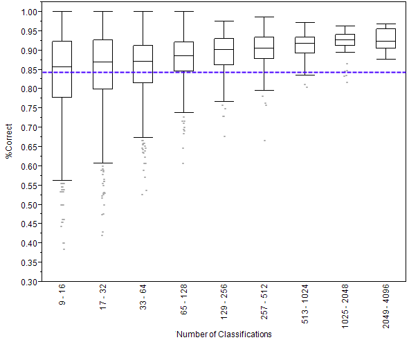
What you see above is called a box plot. On the left side is the percentage of images that were classified correctly. A 1.00 would be perfect and 00.0 would be getting everything wrong. Then you see nine rectangles going across. Each of these is called a box. The key line to look at in these boxes is the one that crosses through the middle. This line shows the median score. Remember that the median score is the score of the person in the very middle of the line if we were to line up everyone by how well they did. (Want to learn more about box plots?)
I’ve divided volunteers into these nine boxes, according to how many classifications they made. The number of classifications is written sideways at the bottom. So, for example, the leftmost box shows the scores of people who made 9 to 16 classifications. You can see that as the number of classifications gets bigger (as we go from left to right on the graph) the scores go up. Someone who does just 14 classifications gets 12 of them right, on average, for a score of 86%. But someone who does 1400 classifications gets 1300 of them right on average, for a score of 93%.
Finally, the purple dashed line shows the average score of all the anonymous volunteers – those that don’t create a user name. We know that these volunteers tend to do fewer classifications than those who create accounts, and this graph shows us that volunteers who create user names score better, on average, than those who don’t.
On a completely different note, if you haven’t seen it already, Rob Verger wrote a really nice piece on Snapshot Serengeti over at the Daily Beast. I recommend checking it out.
Or, read on for details on how I made this graph.
The Wrong Answers
Ever since I started looking into the results from Season 4, I’ve been interested in those classifications that are wrong. Now, when I say “wrong,” I really mean the classifications that don’t agree with the majority of volunteers’ classifications. And technically, that doesn’t mean that these classifications are wrong in an absolute sense — it’s possible that two people classified something correctly and ten people classified it wrong, but all happened to classify it wrong the same way. This distinction between disagreement with the majority and wrong in an absolute sense is important, and is something I’m continuing to explore.
But for right now, let’s just talk about those classifications that don’t agree with the majority. To first look at these “wrong” classifications, I created what’s called a heat map. (Click to make it bigger.)

This map shows all the classifications made in Season 4 for images with just one species in it. (More details on how it’s made at the end, for those who want to know.) The species across the bottom of the map are the “right” answers for each image, and the species along the left side are all the classifications made. Each square represents the number of votes for the species along the left side in an image where the majority voted for the species across the bottom. Darker squares mean more votes.
So, for example, if you find aardvark on the bottom and look at the squares in the column above it, you’ll see that the darkest square corresponds to where there is also aardvark on the left side. This means that for all images in which the majority votes was for aardvark, the most votes went to aardvark — which isn’t any surprise at all. In fact, it’s the reason we see that strong diagonal line from top left to bottom right. But we can can also see that in these majority-aardvark images, some people voted for aardwolf, bat-eared fox, dik-dik, hare, striped hyena, and reedbuck.
If we look at the heat map for dark squares other than the diagonal ones, we can see which animals are most likely confused. I’ve circled in red some of the confusions that aren’t too surprising: wildebeest vs. buffalo, Grant’s gazelle vs. Thomson’s gazelle, male lion vs. female lion (probably when only the back part of the animal can be seen), topi vs. hartebeest, hartebeest vs. impala and eland(!), and impala vs. Grant’s and Thomson’s gazelle.
In light blue, I’ve also circled a couple other interesting dark spots: other-birds being confused with buffalo and hartebeest? Unlikely. I think what’s going on here is that there is likely a bird riding along with the large mammal. Not enough people classified the bird for the image to make it into my two-species group, and so we’re left with these extra classifications for a second species.
It’s also interesting to look at the white space. If you look at the column above reptiles, you see all white except for where it matches itself on the diagonal. That means that if the image was of a reptile, everyone got it. There was no confusing reptiles for anything else. Part of this is that there are so few reptile images to get wrong. You can see that wildebeest have been misclassified as everything. I think that has more to do with there being over 17,000 wildebeest images to get wrong, rather than wildebeest being particularly difficult to identify.
What interesting things do you see in this heat map?
(Read on for the nitty gritty or stop here if you’ve had enough.)
