
Getting good data: part 1 (of many)
Despite the site being quiet, there’s a lot going on behind the scenes on Snapshot Serengeti at the moment. Season 8 is all prepped and currently being uploaded and should be online next week! And on my end, I’ve been busily evaluating Snapshot Serengeti data quality to try and develop some generalisable guidelines to producing expert quality data from a citizen science project. These will actually be submitted as a journal article in a special section of the journal Conservation Biology, but as that is a slowwwwwww process, I thought I’d share them with you in the meanwhile.
So! Recall that we use a “plurality” algorithm to turn your many different answers into a “consensus dataset” — this has one final answer of what is in any given image, as well as various measures of certainty about that image. For example, back in 2013, Margaret described how we calculate an “evenness score” for each image: higher evenness means more disagreement about what is in an image, which typically means that an images is hard. For example, everyone who looks at this photo

would probably say there is 1 giraffe , but we’d expect a lot more diversity of answers for this photo:

(It’s a warthog, btw.)
To test how good the plurality algorithm answers were, we created a “gold-standard dataset” by asking experts to identify ~4,000 images. Overall, we found that consensus answers from your contributions agreed with experts nearly 97% of the time! Which is awesome. But now I want to take a closer look. So I took all the images that had gold standard data and I looked at Evenness, Number of “nothing here” responses, and %support for final species, and evaluated how those measures related to whether the answer was right or wrong (or, impossible). Even though we don’t have an “impossible” button on the SS interface, some images simply are impossible, and we let the experts tell us so so these wouldn’t get counted as just plain “wrong.”
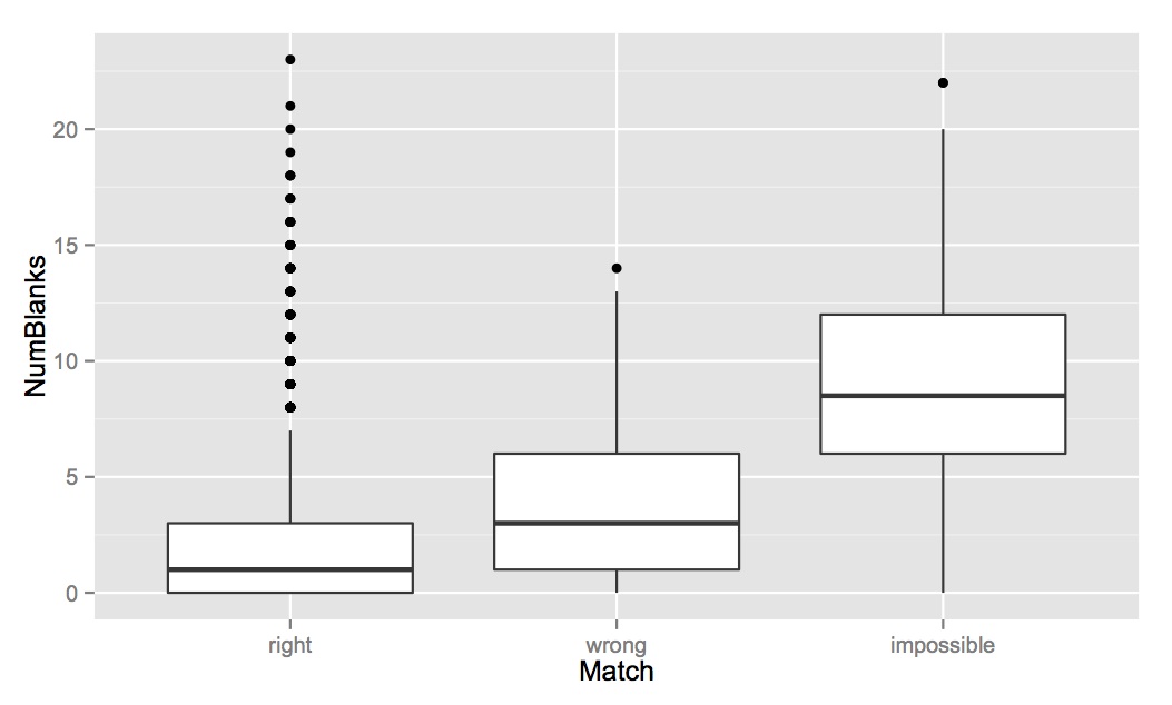
A note on boxplots: If you’re not familiar with a boxplot, what you need to know is this: the dark line in the middle shows the median value for that variable; the top and bottom of the boxes shows the 25 and 75 percentiles; and the “whiskers” out the ends show the main range of values (calculated as 1.5 * interquartile range, details here). Any outliers are presented as dots.
Evenness: The boxplot below shows the mean “Evenness” score described above vs. how the consensus answer matched the gold standard answer. What you can see below is that the average evenness score for “correct” answers is about 0.25, and the average evenness score for wrong and impossible answers is 0.75. Although there are some correct answers with high evenness scores, there are almost no wrong/impossible answers with evenness scores below 0.5.

Percent Support: This number tells us how many people voted for the final answer out of the total number of classifiers. So, if 9 out of 10 classifiers said something was a giraffe, it would have 90% support. It’s similar to evenness, but simpler, and it shows essentially the same trend. Correct answers tended to have more votes for what was ultimately decided as the final species.

NumBlanks: So with the evenness and percent support scores, we can do a decent job of predicting whether the consensus answer for an image is likely to be right or wrong. But with Number of Blanks we can get a sense of whether it is identifiable at all. Margaret noticed a while back that people sometimes say “nothing here” if they aren’t sure about an animal, so the number of “nothing here” votes for an image ultimately classified as an animal also reflects how hard it is. We see that there isn’t a huge difference in the number of “nothing here” answers on images that are right or wrong — but images that experts ultimately said were impossible have much higher average numbers of “nothing here” answers.
So, what does this tell us? Well, we can these metrics on the entire dataset to target images that are likely to be incorrect. In any given analysis, we might limit our dataset to just those images with >0.50 evenness, or go back through all those images with >0.05% evenness to see if we can come up with a final answer. We can’t go through the millions of Snapshot Serengeti images on our own, but we can take a second look at a few thousand really tricky ones.
There’s all sorts of cool analyses still to come — what species are the hardest, and what’s most often mistaken for what. So stay tuned!
3 responses to “Getting good data: part 1 (of many)”
Trackbacks / Pingbacks
- - March 11, 2015

You could have a meter where people can log their own certainness —
Reasonably sure (default) / probable / maybe / I’m stumped.
..or have an option to ‘pass’ if you think the object is not ‘nothing here’ but an ID is ‘impossible’, or ‘too difficult for one to want to spend 20mins trawling the net for better photos’.. (you know the type!).
Would also like a button for ‘distant herd’. Very often there are clear large distant moving herds, but they are impossible to identify. Since there is no ‘unknown’ ID option, I always mark them ‘wildebeest’, and just hope that is more helpful than not.